7 Logo Design Trends That’ll Define 2019
This is a guest contribution by Camille Franc, marketing manager at 99 Designs. After reading “Basic Elements Of Graphic Design” by Michael Risk, Art Director at Oozle Media, Franc reached out to us to discuss this collaborative project. Logos are a critical part of branding, and we are ecstatic about the opportunity to work with other top-notch marketing brands.
We’ve been using logos to communicate our brands for hundreds of years. That’s not an exaggeration – the iconic Stella Artois logo has been in continuous use since 1366, when it was first established as the Den Hoorn brewery. In the 652 years that Stella Artois has been using its logo, companies and groups around the world have capitalized on design trends to communicate who they are to the world. That hasn’t changed and it never will.
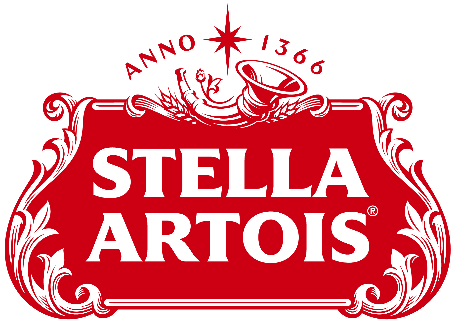
Stella Artois’ logo for 652 years and counting. (Wikimedia Commons)
What has changed is the media we use to communicate. Today’s logo trends are focused on digital communication and formatted to tell brand stories on screens of all sizes. If you’ve got a story to tell, tell it in a way that’ll connect with audiences today and tomorrow. Learn how by taking a look at seven of the hottest logo trends that are already defining 2019.
Logos as Variable as the People They’re For
Having to create logos that work on multiple devices is nothing new. 2019’s take on multi-use logos goes beyond responsive design and considers the different ways a brand uses its logo rather than the different screens the logo will appear on.
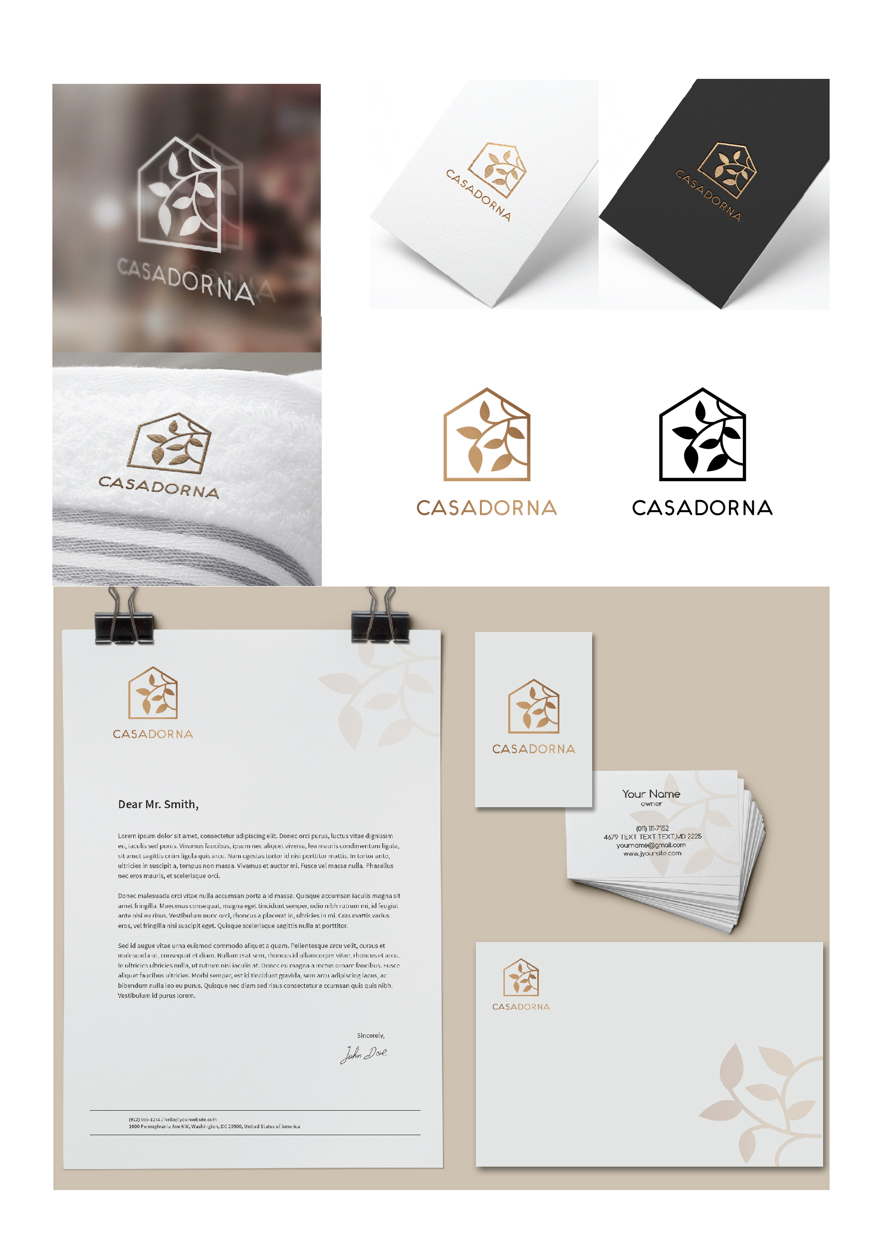
A variable logo is versatile from the get-go, so you don’t have to alter its design for every way you use it. Logo design by Lydia Design.
How will you do that? By thinking of your new logo like a lego set. There’s the flat bottom piece that’s the foundation where you build your castles and cabins. Your logo’s basic shape and text are this foundation. To customize your logo to different audiences and different products, switch out the colors and smaller images while keeping this foundation intact so you don’t lose sight of your brand. Keep an eye out for flexible logos like this that make it easy for their creators to adapt to rapidly changing audiences and scenarios.
Brain-Teasing Logos
Optical illusions are fun because they give our brains a workout. In 2019, get ready to work up a mental sweat looking at new and redesigned illusionary logos.
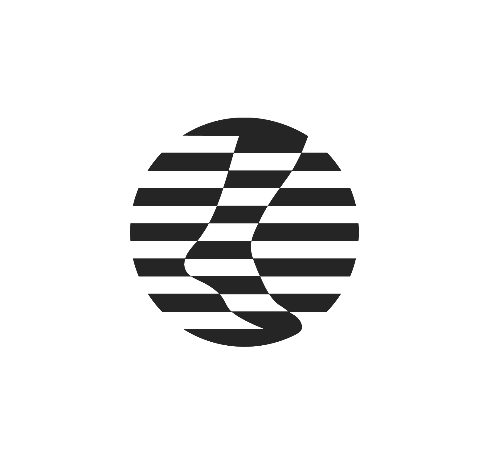
Creating an optical illusion can be as easy as modifying a few of your logo’s lines. Logo for Sunny Strides by Faith.
Logos that create optical illusions are part of the larger design trend of playing with perception and “breaking” graphics to create a post-modern aesthetic that imagines a world where the technology we’ve grown to rely on fails. Take a look at the glitch trend in web design to see more ways designers are gonna riff over this concept in 2019.
Back to logos, you’re going to see a lot of designs that play with things like line thickness, shape, angles and lines to trick your brain into turning 2D images 3D and flat shapes into living, twisting, distortable beings.
Logos That Put Negative Space to Work
Just like illusion logos are bound to be big in 2019, so is another kind of logo that tricks the eye: negative space logos. You’ve seen negative space at work in logos before, like the old Formula 1 logo and the Toblerone logo.
See how the designer used the background create shapes and concept. That’s negative space and it creates a new image. Logo design by Ocelittle.
Utilizing negative space to create an image within your logo is a way to easily work with a limited color palette. Negative space logos combine a few of 2019’s logo trends, minimalist logos and illusion logos, to create images that are uniquely 2019. It works by forcing the viewer to focus on one or two minor details, putting those details front and center to either underscore the brand’s identity as it’s established elsewhere within the logo or to contrast it, creating a fun juxtaposition that demonstrates the brand’s complexity. Some logos use negative space in subtle ways, like building images into the spaces between letters, while others use it so boldly that it pushes the positive space into the background.
Abstract Minimalist Logos
The minimalism design trend that’s been defining the 2010s isn’t over yet. Not even close. In fact, expect to see even more minimalist logos in 2019, but don’t expect them to feel like rehashes of the same old thing we’ve been seeing for the past decade. In 2019, minimalist logos are going abstract!
You’re going to see fewer minimalist logos that are just lines and shapes and more logos that use their lines and shapes to create specific images, like animals and faces. An abstract minimalist logo might look simple, but creating one that works takes significant time and attention to detail on the designer’s part. Minimalism works on the principle that a design needs only its core framework to communicate its message. In 2019, you’ll see lots of new logos that strip down to their core elements and then make something tangible from what they find there.
Logos That Use ALL the Details
Minimalism will rule the design world of 2019. So will maximalism. Keep that in mind when you’re creating a new logo this year: either extreme is a-okay. Don’t be shy about using a maxed-out logo, especially if your brand’s story is a long, detailed one. These logos tell audiences the whole story and then some.
Details give images texture. They make viewers feel they can pick up a logo and touch it. Logo and label design for Humwraps by Mad Pepper.
Highly detailed logos challenge the eye and evoke a strong presence. You can’t ignore these logos. In fact, you can only do just the opposite – when you’re confronted with a dense, detail-heavy image, you have to stop and take time to work through it visually. Maximalist logos exaggerate and accentuate their brands’ most prominent characteristics and lead your eye through a maze that showcases its attention to detail. Detail-dense logos feel tactile. They’ve got teeth and weight and a presence that stays with viewers for the long haul.
New Logos That Feel Like They’ve Existed Forever
It might be kind of surprising to see vintage-looking logos on this list, but one of the biggest logo trends coming this year is creating something that’s timeless from the outset. Typically, logos that feel classic or timeless are logos that have had decades—or in some cases, centuries—to represent their brands. These are logos that have been trusted for generations.
With a crest logo, you can go minimalist or full-detail, super old-school or totally modern. Logo for Elyse and Campbell by Arabella June.
In 2019, more brands are going to be hacking into this trust by using logos that look like they were created ages ago. It doesn’t matter that they’re brand new logos as long as they look the part of trustworthy, established brands. A few ways they’ll achieve this are with textures reminiscent of embossed text, embroidery and rubber stamps, vintage fonts, tight line work and naturally, crests. Crests are almost synonymous with luxury, so if this is how you want your brand to be perceived, go with a crest logo.
Overlapping, Blending Logos
Noticing a few trends? Lots of the logo trends that are going to blow up next year are perfectly suited to work together, and that means you’re going to see a lot of logos that play with two or more trends at once to create totally unique images. That, in itself, is a hot logo trend to look for this year.
Overlapping logos are an effective way to play with colors and their combinations. Logo for Purple Teaming by Makmoer.
Expect to see lots of overlapping logos that create new colors with overlaid letters and shapes. Many of these logos use their negative space strategically and push the brain to make sense out of the unexpected shapes they create. If you want to play with opacity and kerning in your new logo, this is how to do it. The cool thing about these logos is that they’re versatile enough to do basically anything you need them to do, like max out your details or keep them to just a few abstract shapes.
Ready to Finish This Decade on-Trend?
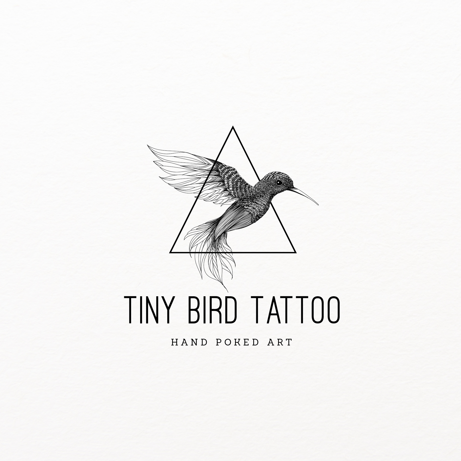
How many 2019 logo trends can you spot here? 2019 will be the year of the logo trend combos. Logo design by Mad Pepper.
Not only does this logo implement the various trends mentioned above, but it also uses a special masking technique that breaks a figure out of its frame. You can see this as the bird seems to be coming out of the triangle, bringing attention to the logo.
As the 2010s reach their conclusion and the 2020s loom on the horizon, ride the transition wave by incorporating 2019’s top logo trends into your brand!

Thanks for sharing your insights on logo designing. While working with Ionva, I also learned a lot about packaging design. But your information had given me new insights thank you!