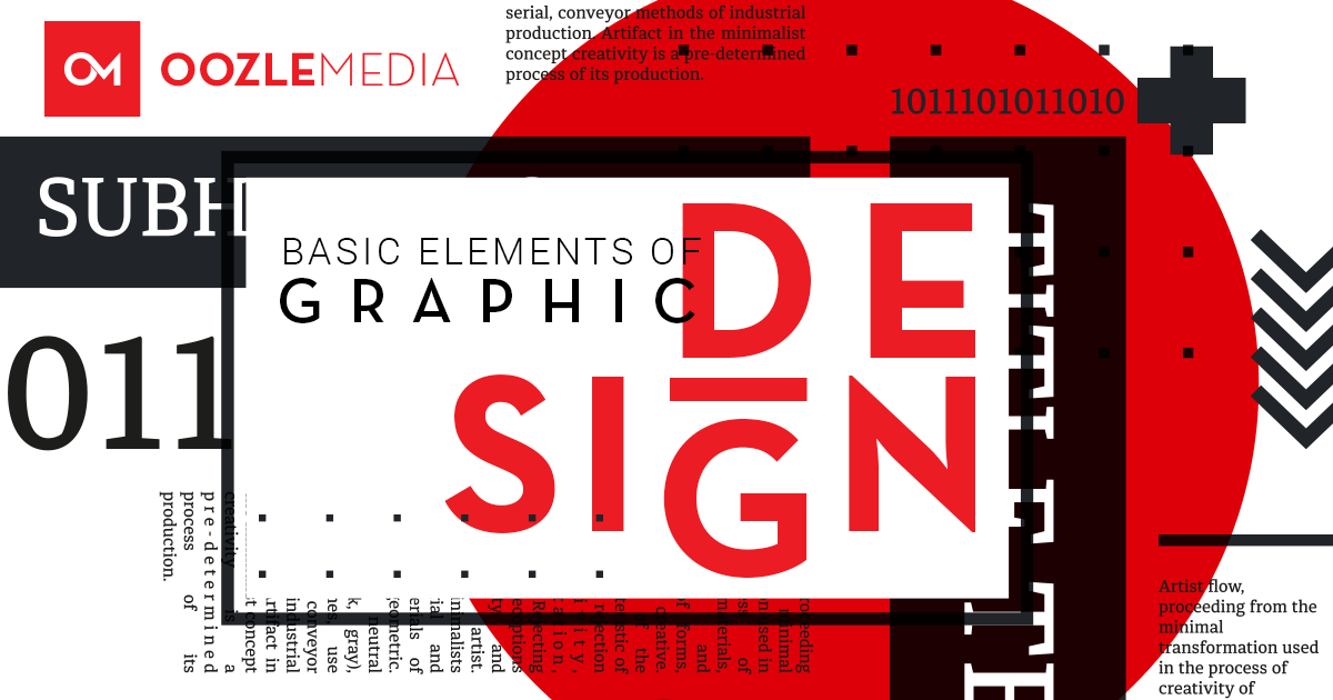
Basic Elements Of Graphic Design
Creating beautiful design is about more than inspiration or a great idea, it’s about understanding the fundamentals of the subject. Although it’s possible to spend years studying the nuances of design and the many varying takes on how to be successful at it, there are a handful of basic elements that every designer should know before beginning any project. Even amateur designers in the field who maintain personal blogs or social media influencers can utilize these following principles to create professional looking pieces. Rules were made to be broken of course, but you have to know what they are first.
Below are the basic elements of graphic design, and by having a strong knowledge of each one of them your designs will not only look better, but will also offer a better user experience and presentation for your clients’s marketing assets.
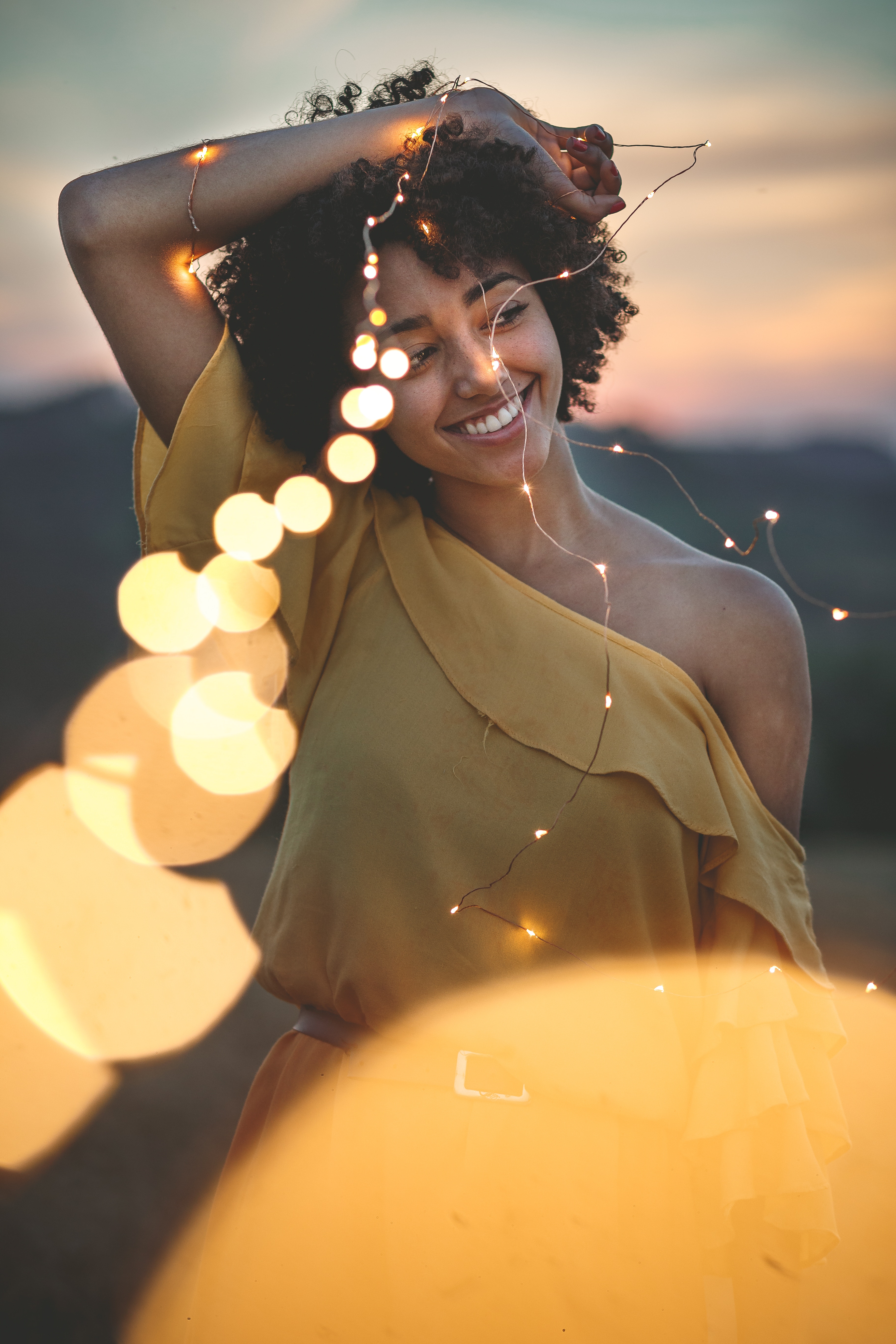
IMAGERY
When consumers are searching for information online very few of them want to read a giant wall of text. In fact, some people will click away from a page if it’s fully loaded with writing.
Articles with relevant images average 94% more total views than articles without images.
- People remember only 10% of information three days after hearing it on average; adding a picture can improve recall to 65%.
- Nearly two-thirds of people say they’re visual learners.
- Consumers are significantly more likely to think favorably of ads that emphasize photography, over ads that emphasize text. (Source: MDG Advertising Infographic)
While companies can climb the search engine mountain by using keywords, building internal links and implementing other text-based strategies, pictures are our secret weapons. Social Media Today points out that pictures are a valuable tool for generating SEO value. Simply by associating some text with an image you can increase the likelihood that Google and similar sites will place your page near the top of its links.
Imagery catches a customer’s attention and stays with him or her for an extended period.
According to Color Matters, “A single image delivers a lot of information in a very short time because we perceive an image all at once, whereas reading or hearing often takes significantly longer to process the same information.”
This means that an image typically demands an immediate response.
Choose images that will speak to your audience
Consider demographics when choosing your images. Will the choice of a certain genre speak straight to the heart of the viewer you are trying to reach? If you’re trying to reach a broad market, or many age ranges, look for something that is broadly appealing; you don’t want to alienate your audience with anything too genre-specific.

Define the Mood
Set a mood or feeling with your image. Do you want your design to be perceived as positive, aggressive, or thought-provoking? Do you want your viewers to feel happy, relaxed, pumped, or uplifted? Pick images with appropriate mood. Fortunately, many stock libraries such as Shutterstock or Unsplash allow you to search their collections using emotion-based keywords.
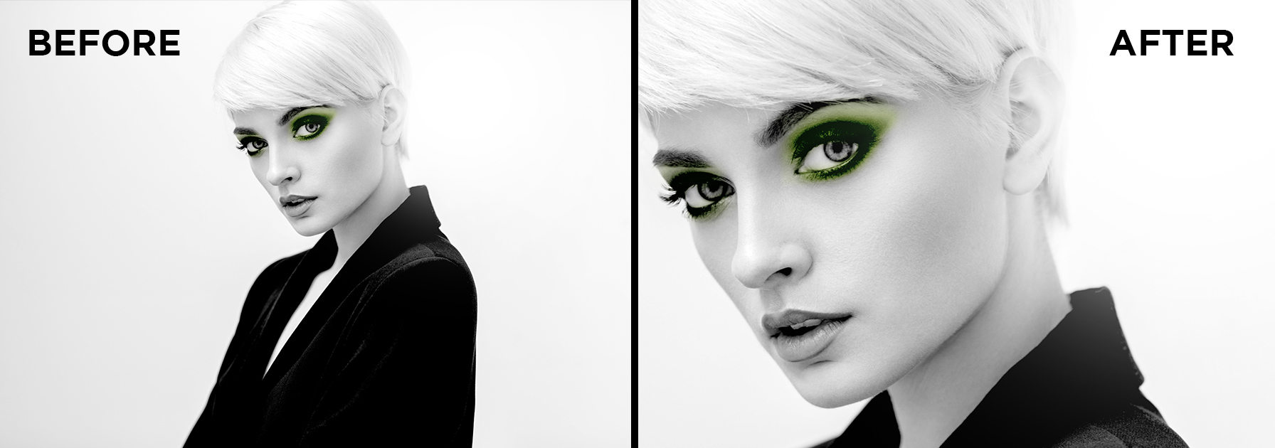
CROPPING
CROPPING an image is the act of cutting away and discarding the unnecessary portions of the image.
Cropping an image can change the emphasis or direction of a design. An image may be cropped to emphasize one particular aspect of a design or to present information more clearly. Clever and deliberate cropping of shapes, form, and letterform can make a design more visually dominating.
Why should you use cropping?
- To emphasize elements of interest
- To eliminate an unwanted portion
- To adjust the shape to fit a given layout
- To enlarge small portions
Cropping an image can:
- Change the direction and balance of a composition
- Change the focus
- Remove unnecessary information or parts that simply don’t work within the composition
- Create greater emphasis
- Help resolve background issues and can assist in placing the figure on the ground more effectively.
Be careful not to crop too much of an image so that it can no longer be understood. Use cropping to create an open composition. You can also using cropping to create negative space for your content or other graphic elements.
Cropping an image is also an important step to editing photos. How you crop an image can have a huge visual impact on the final design. The idea is that an off-center composition is more pleasing to the eye and looks more natural than one where the subject is placed right in the middle of the frame.
Check out this article on tips for cropping photos.
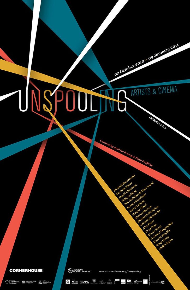
LINES
In drawing, a line is the stroke of the pen or pencil, but in graphic design it’s any two connected points. Lines are useful for dividing space and drawing the eye to a specific location. For example, think about how a magazine uses lines to separate content, headlines, and side panels.
An interesting photograph or image always has lines and shapes within. Some are more static while others are more dynamic. These lines can also create invisible pathways which are great for drawing attention to your copy.
Lines are more than just dividers — the right lines can convey movement and emotion, tying together your composition and making it looked polished and professional.
Rikard Rodin, a graphic designer and blogger with over 15 years of design experience, explains that lines can form the underlying architecture of your project. Defining the line of movement in your composition before you get started can help you construct a design that achieves the desired mood.
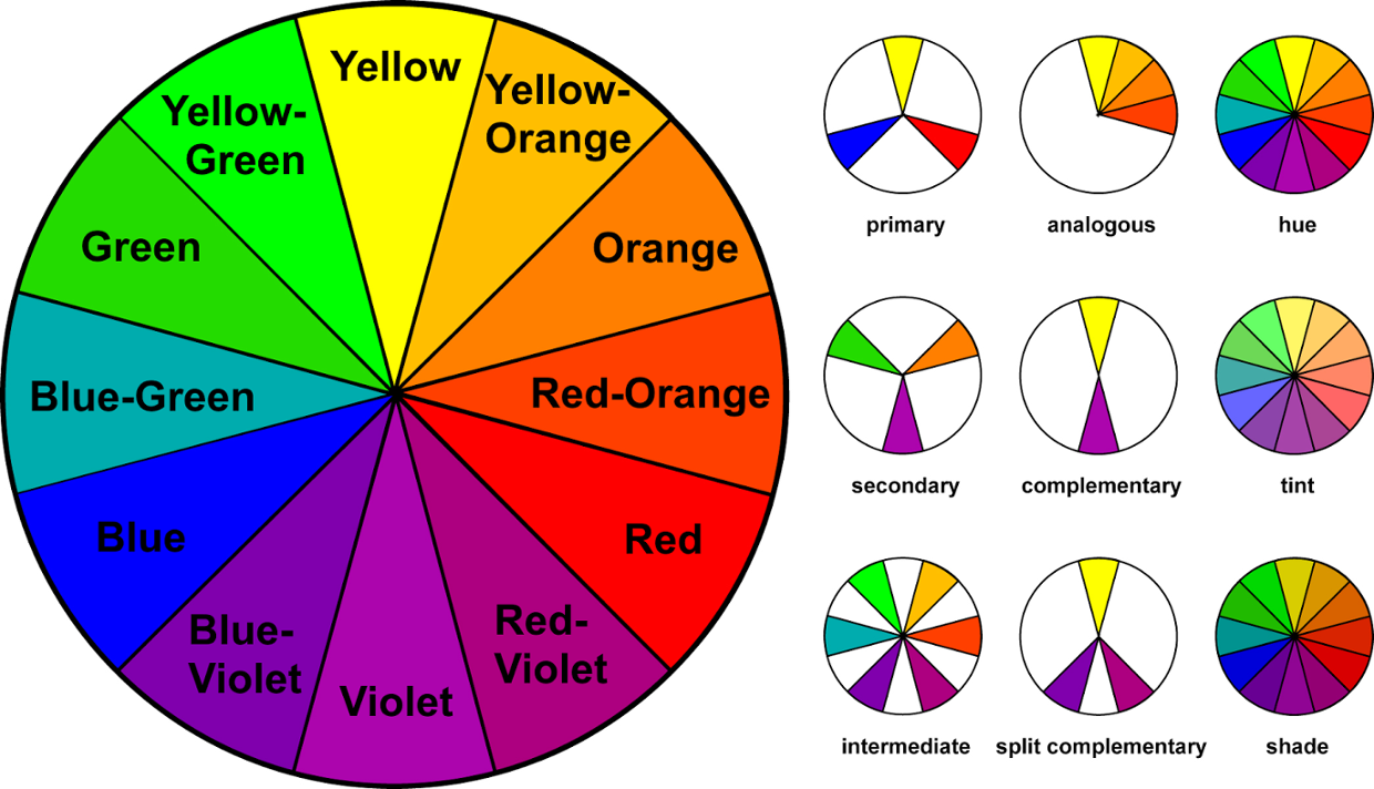
COLOR
The modern color wheel consists of three primary colors—red, yellow, and blue—which can theoretically be mixed in varying ratios to produce secondary and intermediate colors. Although modern research tells us that color theory is actually a little more complicated than that, the color wheel is still a valuable tool for graphic designers looking for aesthetically pleasing color combinations.
When selecting hues for a project consider colors that appear directly opposite or beside each other on the color wheel—these tend to produce the most consistently pleasing combinations. You could also consider using a free online color scheming tool, like Coolers to do the work for you.
SCALE
The scale of different elements in a design will have a big impact on how your audience views and makes sense of your composition. Playing with the relative size of different components in your design allows you to set a focal point, highlight areas of importance, and ultimately guide viewers’s eyes through the piece.
Scale isn’t quite the same thing as size (though many people tend to incorrectly use them interchangeably when discussing design, i.e. “Make the logo bigger!”). Size refers to an absolute measurement (e.g., the sheet of paper 8” by 11”) while scale refers to the direct relationship between elements in a design (e.g. the circle is twice as big as the square).
You can use scale to create a visual hierarchy for your design. When an element is displayed at a relatively larger scale than the other elements in a composition our eyes are naturally drawn to it.
SHAPE
Shapes are at the root of graphic design. They are figures and forms that make up logos, illustrations, and countless other elements in all types of designs.
The Different Types of Shapes
Shapes are one of the basic elements of graphic design and you have a great variety of shapes to choose from. There are three basic types of shapes:
- Geometric shapes
- Organic shapes
- Abstract shapes
Geometric Shapes
Geometric shapes are your basic squares, rectangles, circles, triangles, etc. These typically include sharp corners but may have rounded elements. The most common geometric shapes are:
- Squares and rectangles
- Circles
- Triangles
- Diamonds
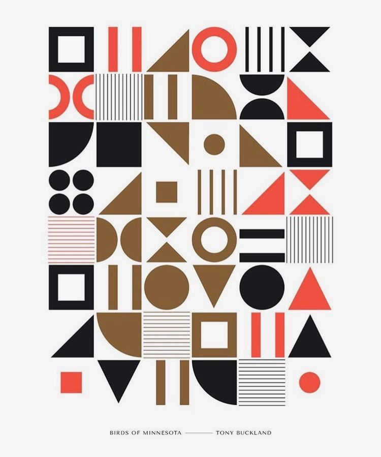
Organic Shapes
Organic shapes have flowing lines and are also called “natural shapes.” They resemble objects found in nature such as a pond (a squiggly blob), an apple, or a leaf.
Abstract Shapes
There are also those shapes which we cannot relate to reality known as abstract shapes. Abstract shapes are those that have a recognizable form but are not “real” in the same way that natural shapes are. For example, a stick-figure drawing of a cat is an abstract cat shape, but another cat in a photo is a natural shape. These are the freeform shapes like spirals, cloud-like formations, and multi-dimensional shapes that have become popular in modern logo design.
- Alphabet glyphs
- Icons
- Symbols
Using Shapes in Your Designs
Using shapes properly is one of the keys to successful graphic design. The form, color, size, and other characteristics for the shapes in a layout can determine its mood and message.
- Shapes can be grouped or used in patterns to add emphasis.
- The “white space” or negative space left between shapes will also significantly impact a design.
- Experimenting and altering of shapes within a design can ultimately lead to the desired result.
When working on a design, again consider both the shapes you’re deliberately incorporating (the positive shapes), and the shapes naturally formed around those shapes (the negative shapes).
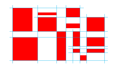
ALIGNMENT
Think of alignment like an invisible axis that runs between elements, connecting them visually either by their edges or centers.
Alignment most frequently comes up in design discussions about text and typography, but it’s equally important to consider the alignment of non-text elements when building a balanced, orderly composition.
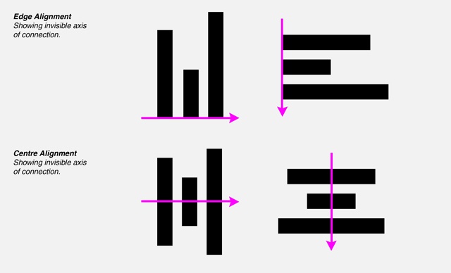
The example above illustrates uniform edge and center alignment—but that doesn’t mean all the elements in your composition always have to follow a single pattern of alignment. In the image below, you can see the elements are aligned by their edges, but not united by a single axis.
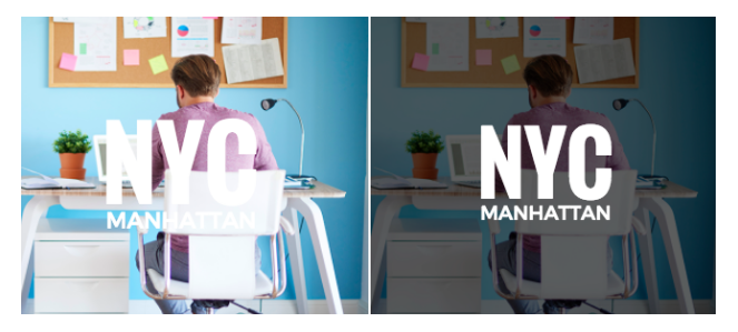
 CONTRAST
Contrast refers to the juxtaposition of elements that strongly differ (big vs. small, light vs. dark, etc.) to create visual interest or draw attention to particular elements.
Without contrast, our designs aren’t just lackluster and boring to look at, they’re also difficult to understand. A lack of contrast is often what separates mediocre design work from designs that look professional, polished, and clear.
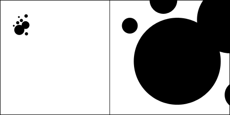
SPACE
Space is exactly what it sounds like: the empty areas between elements in your design. When it comes to creating professional-looking designs on your own, sometimes what you don’t include is just as important as what you do.
Space can be used to both separate and connect elements in a design. Wider spaces separate elements from each other and narrower spaces connect elements to reveal relationships between them. Overlapping elements maximizes their relationship.
By controlling and shaping space in our designs, we create rhythm, direction, and motion. We create design flow through our use of space.
Whitespace does three main things in a design.
- Creates groupings of elements
- Creates emphasis and hierarchy
- Improves legibility
When working on a design, consider not only the elements you’re including (such as images and text), but how they’re arranged and grouped in the composition. It can be tempting to fill every inch of your digital canvas with something, but try to give your elements some room to breathe.
TYPOGRAPHY/FONTS
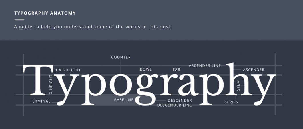
The Basics
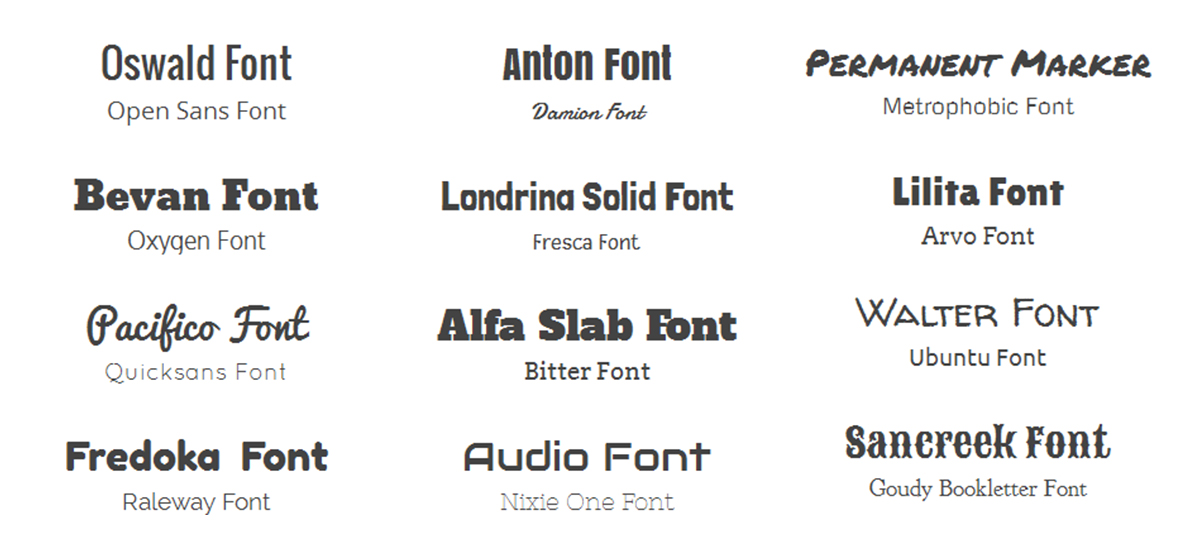
Your first concern is choosing a font that matches the message or purpose of your design. Before you ever start browsing through fonts that are available, it would be a good idea to brainstorm some of the qualities or characteristics that you want your design to communicate.
That way when you’re choosing a font, you already have a blueprint that you can match up your font with. This is important because every typeface has its own mood or personality. Maybe it’s serious, casual, playful, or elegant. You’ll need to determine what a particular font is saying to you, and whether that fits with your design.
If the characteristics the font is communicating don’t match the message of your overall design, then there will be a visual disconnect for the viewers or users of your design, and you don’t want that. When browsing fonts, it can be easy to get caught up in all the fun and interesting choices, but don’t let personal preferences get in the way; a font you think is distinctive or stylish may not be useful or appropriate for the project you’re working on.
If you find yourself getting off track, just ask yourself this question: Does this font support the qualities of the brand or compliment the purpose of my design? The most effective font choices do just that.
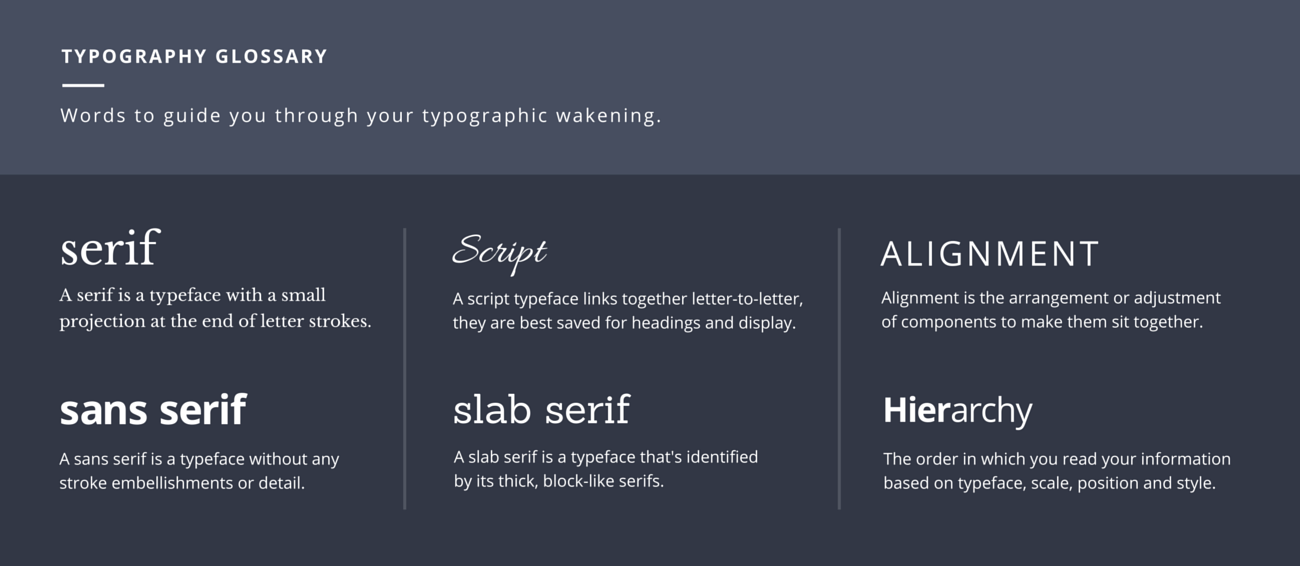
Combining Fonts
Choosing two or more fonts to use together can be tricky. You want the fonts to compliment each other, but not be too similar — different, but not so wildly different that they clash. Avoiding these extremes of too little or too much contrast often ends up being a process of experimentation and trial-and-error.
Finding a font combination with a level of contrast isn’t a step-by-step process, but is usually the result of a mashup of personal taste, practice, instinct, and observation. But this process doesn’t have to be completely mysterious. While you’re developing an eye for pairing fonts, you can take a few shortcuts to get started:
- Find a shared quality: Fonts that look significantly different but share something in common are more likely to work well together. That quality might be general proportions like letter height or width, or two fonts might share an underlying structure or skeleton. Even if the similarity is subtle, it will help give your font combination a basic cohesion.
- Give each font a job: your chosen fonts will need to be different enough that they create a clear visual hierarchy — showing viewers where to look and what’s important. One sans-serif and one serif font are often enough to do this effectively.
Font Weights
You will also want to consider using different font weights together. For example you can use the same font but the top sentence is light and the bottom sentence is bold or together in the same sentence.
COMPOSITION
Finally, after pairing all of these concepts together we get the final composition. Train your eye to see how everything fits together. Your various assets should relate to each other in one cohesive image and message.
Some additional elements of composition to consider are:
Dominance and Emphasis
While you can talk about emphasizing one thing or another, the element of emphasis has more to do with an object, color, or style dominating another for a heightened sense of contrast. Contrast is intriguing, and it creates a focal point.
Balance
There are two schools of balance: symmetry and asymmetry. While most designers, artists, and creative folks much prefer asymmetry for its eye-catching nature, symmetry does have its place.
Harmony
Harmony is “The main goal of graphic design,” according to Alex White, author of “The Elements of Graphic Design.” Harmony is what you get when all the pieces work together. Nothing should be superfluous. Great design is just enough and never too much. Make sure all the details work with one another before you consider the project complete.
CONCLUSION
Design is a complicated business full of principles, tricks, and techniques, some of which you can learn from others, and some of which you have to learn on your own.
Take every “rule” you read about with a grain of salt and apply it where it feels appropriate, but abandon the rules whenever you feel they are not relevant. Design is a constantly evolving and changing field and each situation is different, unique, and exciting.
For the beginners among us, keep these principles in mind. Whenever you’re out and about, take note of social media, television, posters, menus, and signs you see, and try to identify which principles it uses and how it uses them. Develop a “design eye” and keep a mental (or physical) record of interesting ways to use these techniques and store that away for a rainy day.
Overall, have fun with it. Play, experiment, but do it with purpose and care. Good luck!
When you hire Oozle Media to fill your digital marketing needs, you gain access to our graphic designers who can create custom artwork that keeps your brand current and competitive in your marketplace. You can contact us anytime online, or call us at 877-986-6529!
Excellently written and perfect implementation of examples – Awesome Article!
Great read! Thanks so much.
One of the informative articles I have read so far