Conversion Best Practices Your Website Could Be Missing
Becky Banks
Website Content Manager, Oozle Media
Conversion Best Practices Your Website Could Be Missing
Thanks. Sorry about the little hiccup at the beginning. Thanks for the introduction, and I’m excited to speak here. Today, as you can see, I’m talking all about your website, which an optimized website is so, so, so crucial for beauty schools. Give me a second. I feel like it’s a missed opportunity to not introduce both myself and the cats.
As stated, my name is Becky Banks, Rebecca Banks, actually, and I’ve been working in Oozle Media for over six years. I’ve been in multiple departments at Oozle over the years, but currently I am the website content manager. The black-and-white cat on the bottom is Peaches, and that is my cat. That is her default state. At the top is my roommate’s cat, Remy, and I thought I got the perfect blip there. He was just sticking his tongue out there for a solid minute. I was like, “Oh, thank goodness.”
As the resident crazy cat lady and introvert in the company, I’ve always felt like I fit really well in the web development department, because when it comes to contacting a business, I hate just picking up the phone to schedule an appointment, ask about services. I would rather just read something on a website than to be able to have to talk to somebody. However, what that also means is I’m constantly focusing on how I use each website I interact with, and I can take what I’ve learned and share it with you.
What is a Website’s Conversion Rate
First, when you talk about conversion rate optimization, you always have to cover what a conversion rate even is. Conversion rate is the percentage of website visitors who take the desired action, whether it’s filling out a form on your website or calling a certain phone number. You can figure that number out by taking the leads, usually, form fills, dividing that by the total number of visitors, and of course if you want to make that a percentage, then you multiply that number by 100.
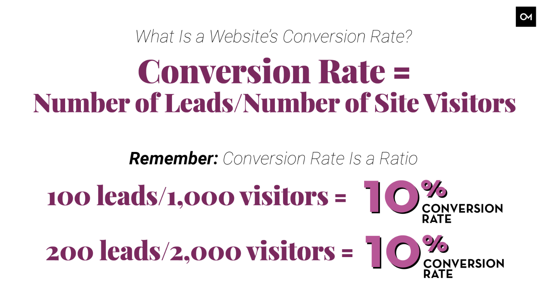
In the case of beauty schools, each lead you get from your website represents another opportunity to enroll a new student, which translates to more profit for your school. The higher the conversion rate, the better, right? Not exactly. Keep in mind conversion rate is a ratio, so you could still be getting more leads even if your conversion rate doesn’t increase. In an ideal scenario, you should be looking to increase both the number of leads and website traffic at the same time, to increase your school’s chances of success. In this example, a hundred leads with a thousand site visitors is a 10% conversion rate, while 200 leads with 2,000 website visitors also have a 10% conversion rate.
Two Key Elements to Help Improve Your Conversion Rate
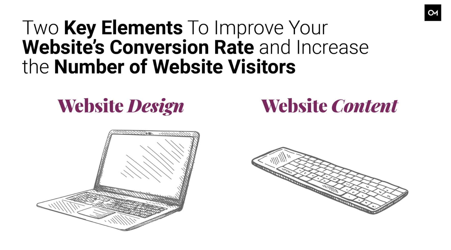
There are two key elements to increasing the number of leads on your website, and both of these tactics also increase the number of website visitors too, so it’s kind of a win-win, website design and website content.
Let’s Talk Website Design
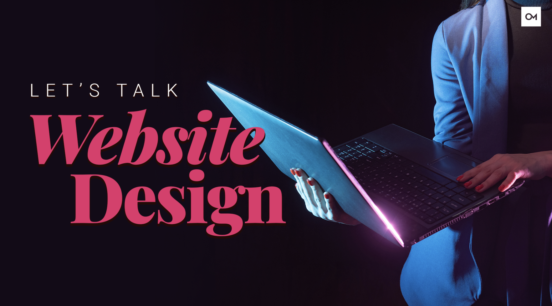
First, of course, we’re going to talk about website design. I feel like website design is one of those things that’s super important, because it’s the way that it looks. Sometimes you’ll scroll over content and you’ll just kind of skim, but you can’t miss a website’s design.
I’m going to have a poll, so go ahead and give your answers in the chat. If you’re an Apple user, how comfortable are you using a Windows device, or if you are a Windows user, how comfortable are you using a Mac? I want to know.
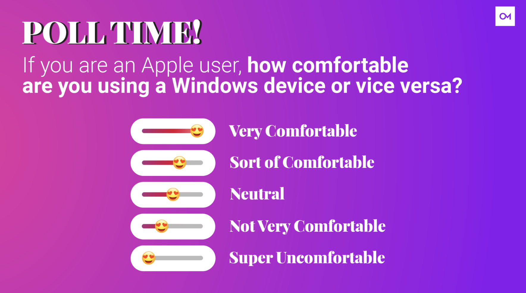
Very … what? What? You guys are a lot better than I am. I am a Windows user and I am currently on a Mac presenting here, and I was like, “I don’t even know where the power button is on this computer.” I was like, “I don’t know how I always hit … ” the Command and Control thing drives me nuts, and it’s so difficult.
Now, here’s why I wanted this question, is that that uncomfortable feeling when you’re using an unfamiliar device is the same feeling someone gets when they have a hard-to-use website. You don’t want your website visitors to work to figure out where they should go, how to use your website, or what action they should be taking. If your site visitors can’t figure it out in less than a few seconds, then they’re gone. They’ll leave your website. User experience really influences conversion rate.
Here is actual something that we’ve done, using a tool called Hotjar. Hotjar is a weighted A/B test. It creates these heat maps, and can also do clicking data. Using a tool called Hotjar, we found that approximately 25% of users don’t scroll past the fold, which is that first screen size when you first enter a website, and this is just on the homepage.
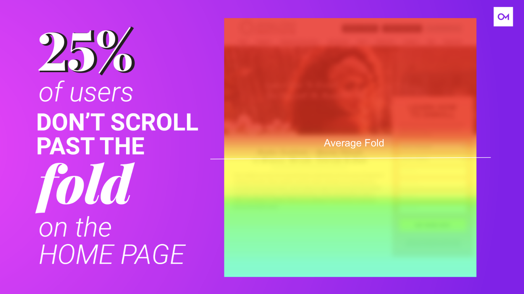
As Patrick covered earlier, the homepage is one of the most visited pages on most websites. If you want more conversions, if each site visitor doesn’t see immediately what action you want them to take, you’re missing out.
It’s crucial to have a clear call to action above the fold with a color that stands out, and other conversion opportunities further down the page for key pages like your programs or maybe your salon services. Additionally, it’s important to make your website user friendly and easy to navigate, because much like using a Windows or Mac device, you want it to be standard enough that anyone can use it regardless of their technical proficiency.
We run into this all the time, of people saying, “Well, I don’t want my website to look like this other beauty school’s website.” Or it’s like, “Oh, I want mine to look different. I want mine to stand out.” Again, the problem is the more different you make your website, the harder it is for your website visitors to use it.
Where Are The Call to Actions?
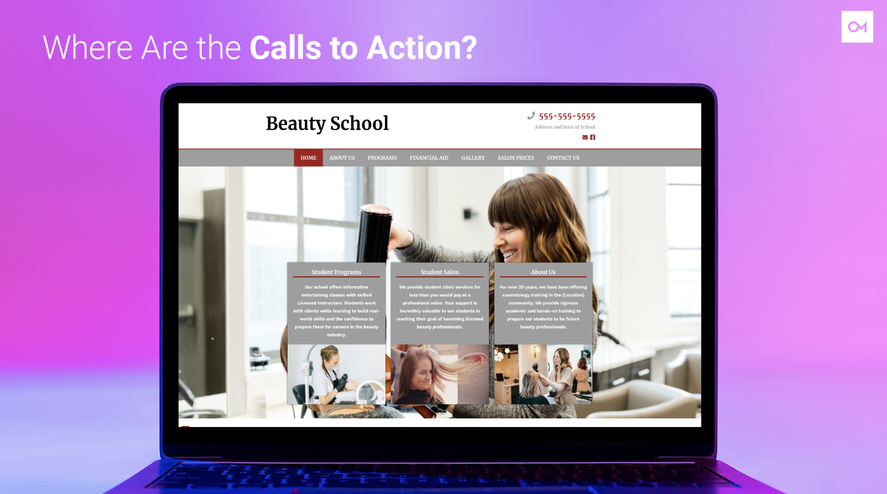
Next, here’s a real example. This is a beauty school website. I removed the logo. I removed any mention of the name. If they are here, I’m sorry. I think your website’s pretty, but I don’t think it’s optimized for conversions. I didn’t change anything other than removing the logos or the name of the school. The imagery is the same, the boxes are the same, the navigation is as it was. Let me know in the chat, where are the calls to action? What actions does this school want someone to take, from the second someone gets on that homepage?
Call, top right, none, none. Call them. Yep, you guys are all seeing it. There’s kind of this call in the top right. I did find out that the Student Programs, Student Salon, and About Us are all clickable, but they don’t look like buttons. It’s not really great.
Now, I took the same website, and again, this is where people are like, “Oh, I don’t want my website to look the same,” but there is a reason that we design our websites the way that we do. This is an example of what this school could look like as an Oozle website. Where are some of the calls to action on this website? Again, I didn’t change the imagery. I maybe added content a little bit, but I didn’t do much. Yep, we’ve got a Book A Tour, we’ve got a phone and we’ve got some contact info right in front, See The School.
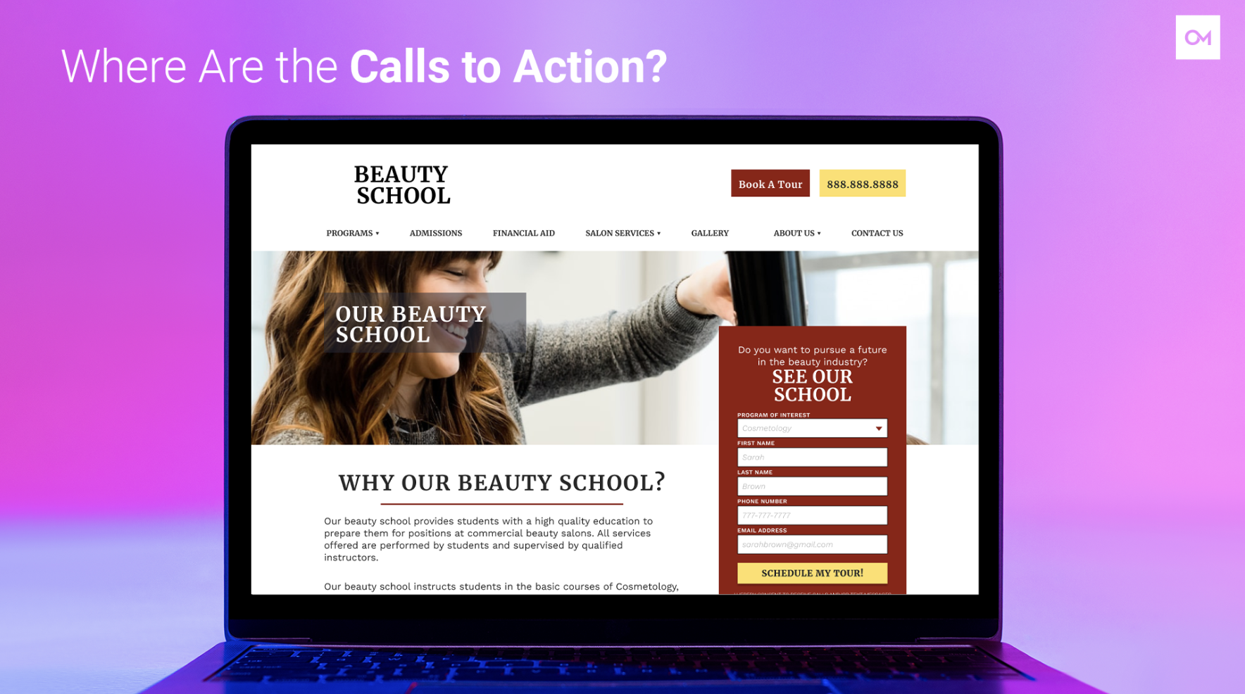
Something else that you might not think about is that we’ve got the picture looking at the form. There’s a form right at the top. The image is looking at the form. There are a few other buttons and phone numbers that are obvious. I also added an additional color, so that yellow. It’s going to stand out versus just all of the reds and grays. By optimizing your website design, you can increase your conversion rate and you can attract more qualified leads. In this case, I didn’t change any of the content or imagery, and yet it’s going to make a huge difference.
The other thing that I actually also did change was the navigation order. Essentially instead of the Home first, I put Programs first and then Admissions, because we look at screens from left to right, and so we always want to make sure that the most important information, like the Programs, are on the left. However, another user experience that we as users expect Contact Us to be on the right, so that’s why it’s at the end.
Ways to Improve Your Website Design
You’ll want to screenshot this slide. Here are my top seven-ish tips to make sure that your web design is made to improve your conversion rate. Of course, have a form high on the page. Choose a color for buttons that stands out. Use images of smiling faces and people. Beauty is a people industry, there’s no doubt about that, and so we always want to make sure that the imagery we use represents our audience and gets people excited. Of course, keep your website’s navigation simple, and then use multiple CTAs throughout each page of your website.
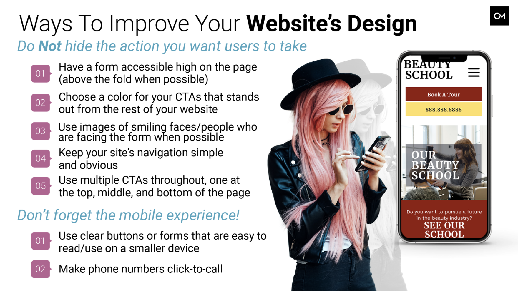
Something that you never want to forget is your mobile experience. Google is mobile-first, which means that Google is calling your mobile website before the desktop version. Also, as beauty school students are typically younger, they’re more likely to visit your website on mobile devices than a computer. Of course, make sure that your website has clear buttons and forms that are easy to use on a smaller device. Also make it so people can call your school with just a simple touch of their mobile device.
Let’s Talk Website Content
Next, let’s talk website content. Now that we’ve got the design set, it’s time to talk about the words. Again, what I covered and alluded to before is that most people don’t actually read the content unless they’re really interested in learning more. However, what people do read, it should always be about building trust with your audience. The other thing to keep in mind is that whatever content is on your website, Google is crawling that content to determine whether or not your school is relevant and should rank.
Build Trust With Your Website Visitors
Here are some ideas to build trust. Remember that you’re not just selling a service, you’re selling an experience, and so you want to make that a positive one. You want people to know what to expect when they fill out a form on your website, so be specific. Do they get a free guide? When will someone reach out? Do others have good things to say about your school?
Make it prominent. Prove to the user that giving their information is worth the effort.
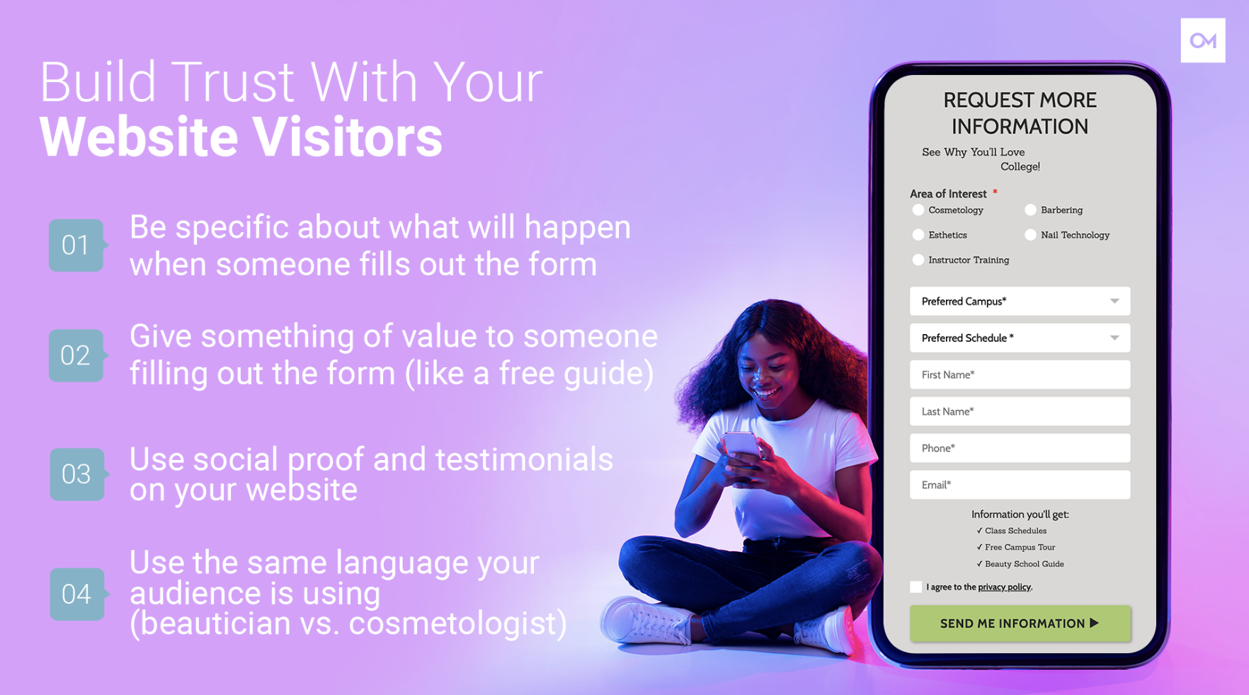
The other thing that you want to keep in mind is you want to use the same language as your audience, because again, you want people to feel like they have found the right place. We run into this a lot where sometimes some areas might use beautician, others use cosmetologist, and some people are like, “Oh, beautician is outdated, cosmetologist is how you want to say it.” Or you might run into someone might not know what an esthetician is, so they might say, “Oh, skincare professional.” You want to make sure that you know how your audience is referring to you, and use that same language in your content.
Transform Your CTAs
Now, the next step is transform your CTAs. Gone are the days of Submit or Click Here. That is old, 2000s, ’90s internet. You need to change your CTAs to be more specific. Build trust. Get people excited about providing their information, that they want to talk to you about starting beauty school. Here are a few fun examples you can change buttons to. You can change Submit to Send Me Info, Schedule Appointment to Schedule My Tour, Download to Send Me My Guide.
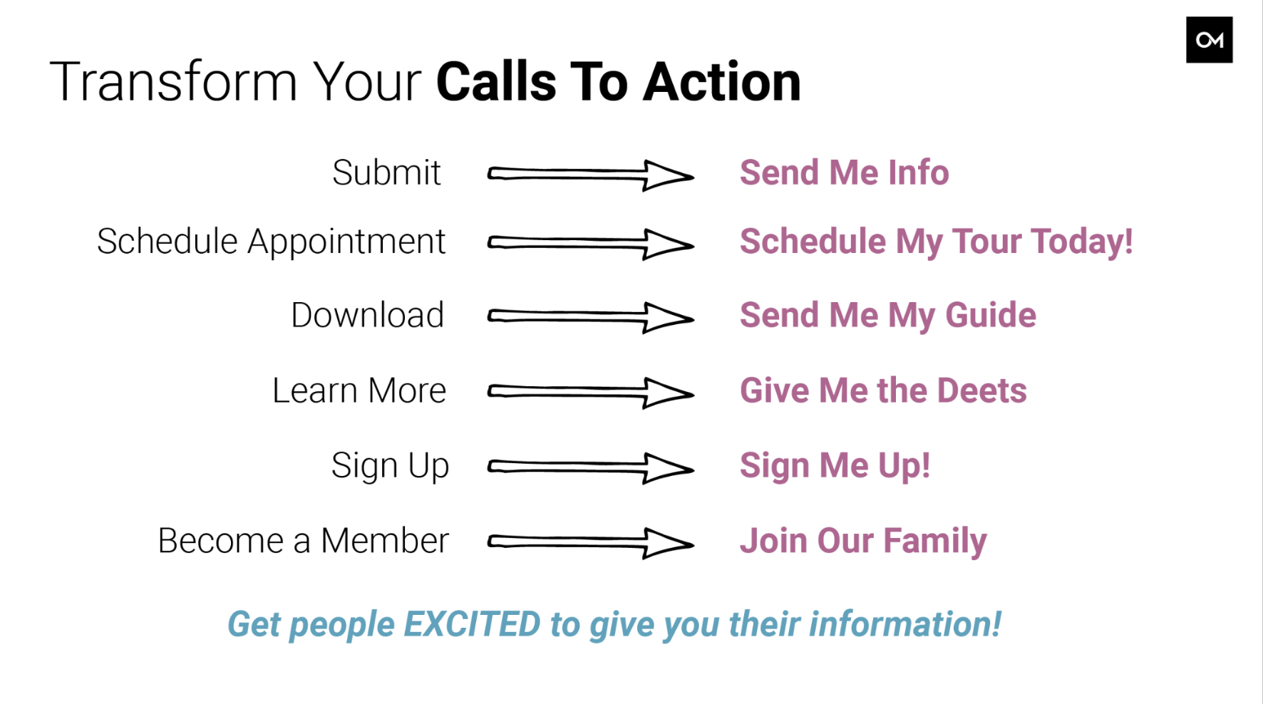
These changes bring the reader in. They aren’t just reading something about you, they’re reading and seeing themselves at your school before they’ve even submitted their info. Now, you might see sometimes on Oozle websites we use Learn More, but again, we’re really focusing on headers and making it very clear to people what happens when they click that button.
Using AI For Ideas
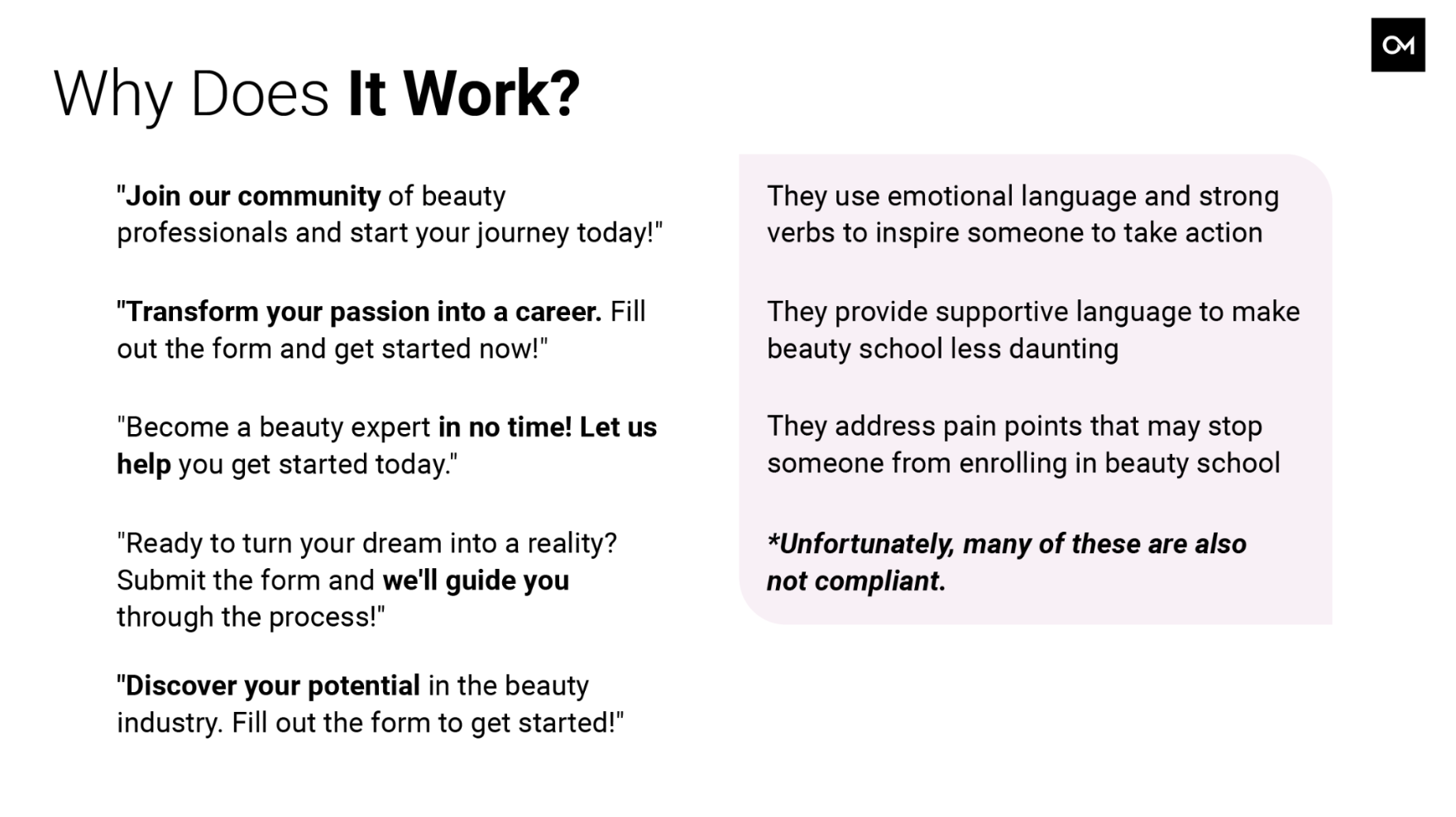
Next, you can use AI for ideas. We’ve covered a lot about AI. This was me typing in a prompt. You can see it’s longer. We did have that interesting session earlier, but the truth is that ChatGPT is a great way to get some inspiration. I created a prompt asking for some CTAs and then just essentially had it give me some ideas, and I really enjoyed what it gave me. I took these responses and put them on a slide. It’s fun, because it’s stuff like, “Join our community of beauty professionals and start your journey today.”
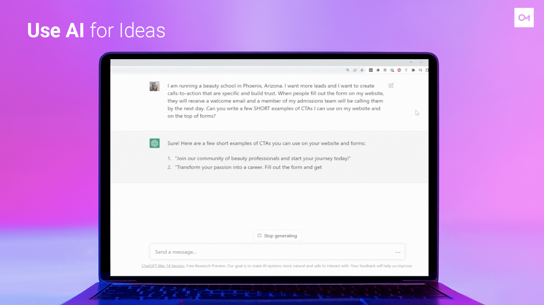
I highlighted some phrases, and these phrases like join our community, transform your passion, complete your education in no time, let us help, we’ll guide you, these phrases build trust. They get people excited about providing their information. They answer pain points that your audience might have. Unfortunately, they also aren’t compliant, so you’ve always got to edit them, but they’re usually pretty easy to transition from, even if you removed that into a career. It’s like, “Transform your passion and do what you love.” These are some fun phrases that can get people excited to fill out a form.
Do These Tactics Work?
Of course, these are some stories, but we know that numbers talk, so you don’t just have to take my word for it. Here’s some real data that we have found. Here’s a comparison of non-Oozle websites to an Oozle website. These schools are various sizes with a different number of locations, and they have different pools of data. From what I could see of the numbers that I pulled, we generally saw a 2% to 3% conversion rate for a non-Oozle website. This isn’t necessarily bad. I will say that conversion rates in general are usually pretty low, especially when you consider all the different reasons someone might visit a website.
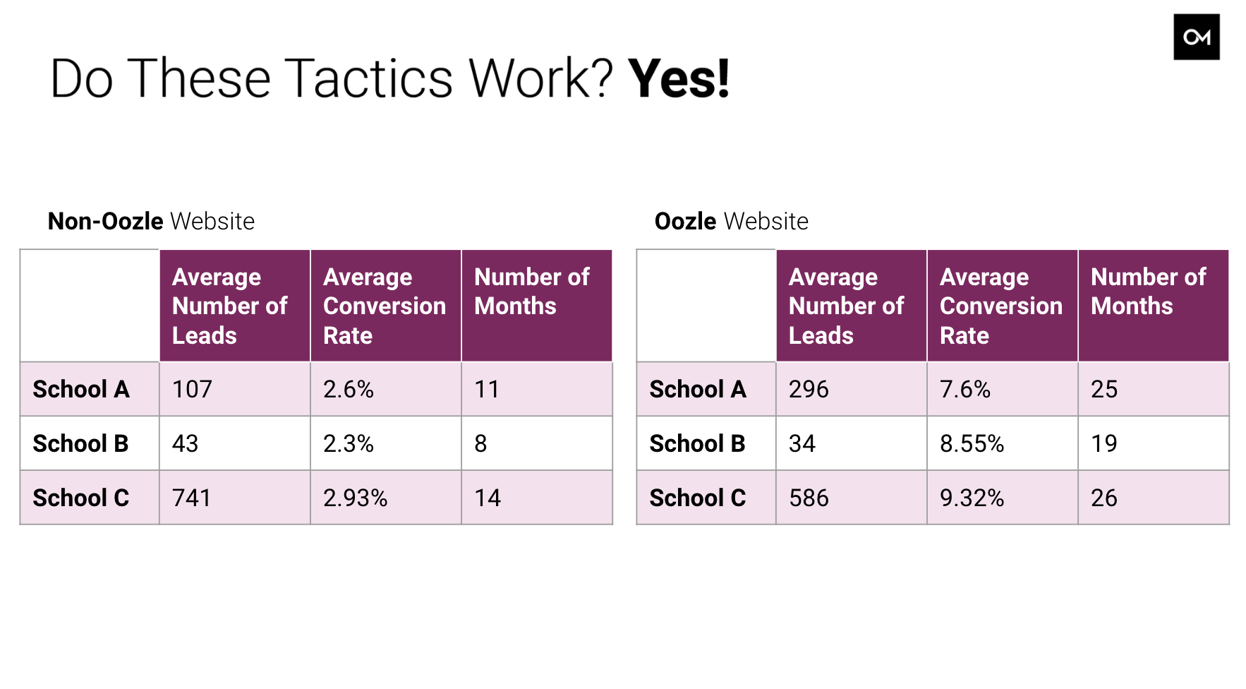
We talked about blogs, how someone might still be in the exploration phase, or we talk about maybe it’s a salon style, like they’re calling for a salon appointment. You have those things that skew the data. I did see that when we compare it to an Oozle site, the average conversion rate could be anywhere from 7% to 9%. In fact, when I was looking through these, I didn’t want to include it because it felt like such an outlier, but I saw a conversion rate as high as 15%, which is crazy to me.
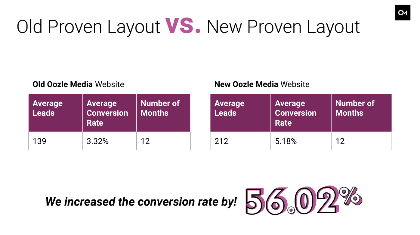
Then the other thing to keep in mind is that at Oozle Media, we’re always trying to outdo ourselves. We know that industry changes or the audience changes, and so we always compare in our reports year-over-year data, because we always want to one-up ourselves. We had a client who decided to redo their Oozle website, and in a matter of months we increased their conversion rate by 56%. They went from a 3.32% conversion rate. This was a website from I think 2019. It was a few years old, and then it increased to 5.18%.
The key differences between the old website and the new website is what I’ve covered already, website design and website content. We made CTAs a lot more prominent. We added a bunch more content about what to expect of the school and how to enroll, and ultimately it worked. I was so happy to see it, because again, honestly, conversion rate is like an experiment. You never know what’s going to actually stick.
Increase Your Conversion Rate With a Quiz!
The other thing at Oozle Media is that we’ve added a product of a quiz. We’ve seen huge success with these quizzes because essentially we see a significant increase in leads, because they’re designed to be fun. These quizzes can be anything, like, “Fill out this information and get an idea which beauty school is right for you,” or, “See how prepared you are for beauty school.”
It works because it’s an easy ask for a potential lead or a student that only requires the user’s time and not money, and they’re fun. It means that users are more likely to fill them out compared to a lengthy form. The promised value to them, as we talk about being specific about what they’ll get, is that they get information about them and not an admissions call.
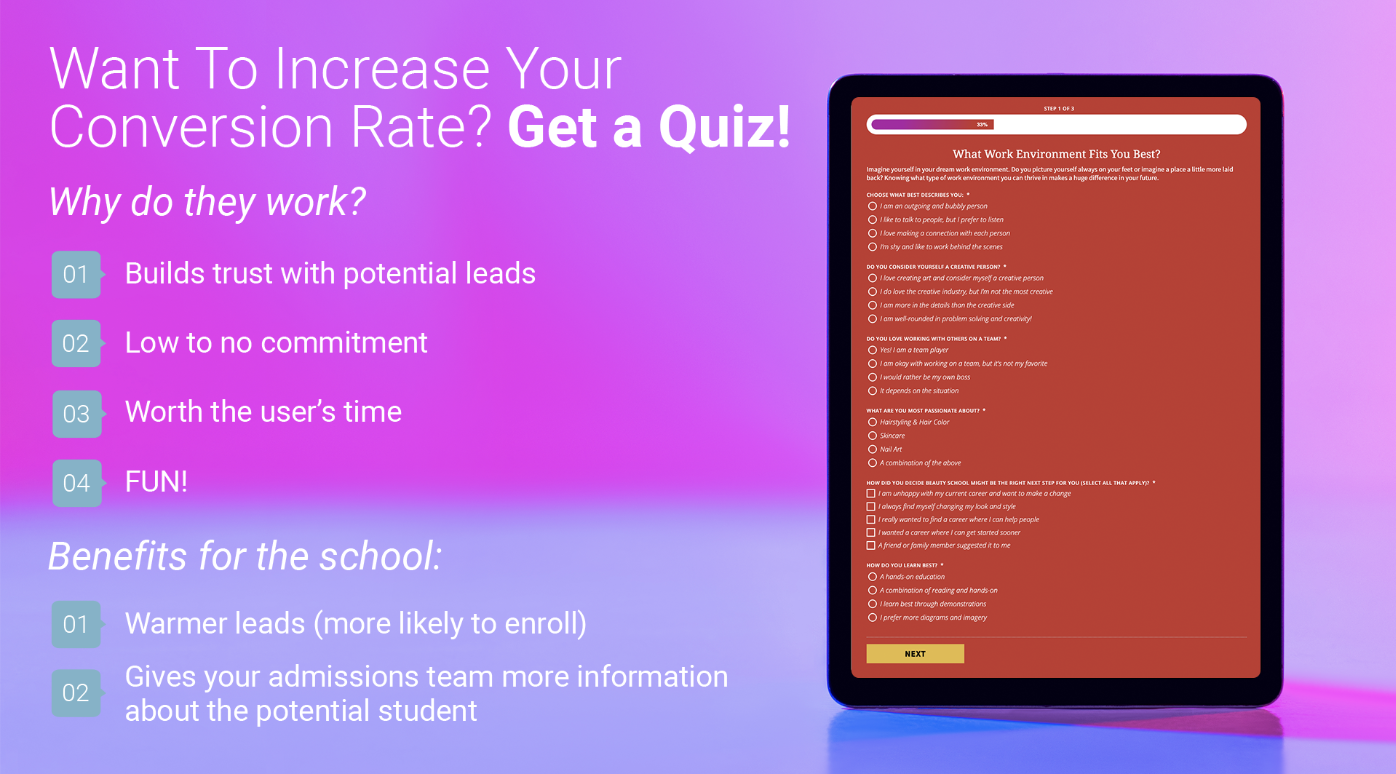
Quizzes, of course, do more than increase conversion rate. We all know that a lead on a website is just the first step of the process, but they’re a way to get more qualified leads. The user has invested time in your school, and all the answers they shared are also provided to the admissions team. This means that your team has more talking points that they can use when they call that lead.
If you already have a website from Oozle Media, this can be a very affordable option to get more leads, and it’s relatively easy to implement. I will say that sometimes getting the answers can be a little bit tricky, but the writing and flooding it on your website is pretty easy. The nice thing when you put a quiz on your website is that it’s not an alternate or taking away. It’s just a way to increase traffic, increase leads, without doing anything else. That’s where it can increase that conversion rate because it doesn’t necessarily increase traffic, but it does capture those who do visit your website.
Is It Time For a New Website?
Of course, I will say if you don’t have an Oozle website, is it time for one? Unfortunately, it isn’t easy to just change your website. This is something you’ll have to talk to web developers or a new agency, to see if it’s time for a new website. The way that we like to talk about websites at Oozle is it’s like your house. I know it’s a bigger analogy, where it’s like with some of our website redesigns, we change the paint on the walls, but we don’t actually choose where a form is. That’s where sometimes it’s easier to just take the house down and rebuild a new one.
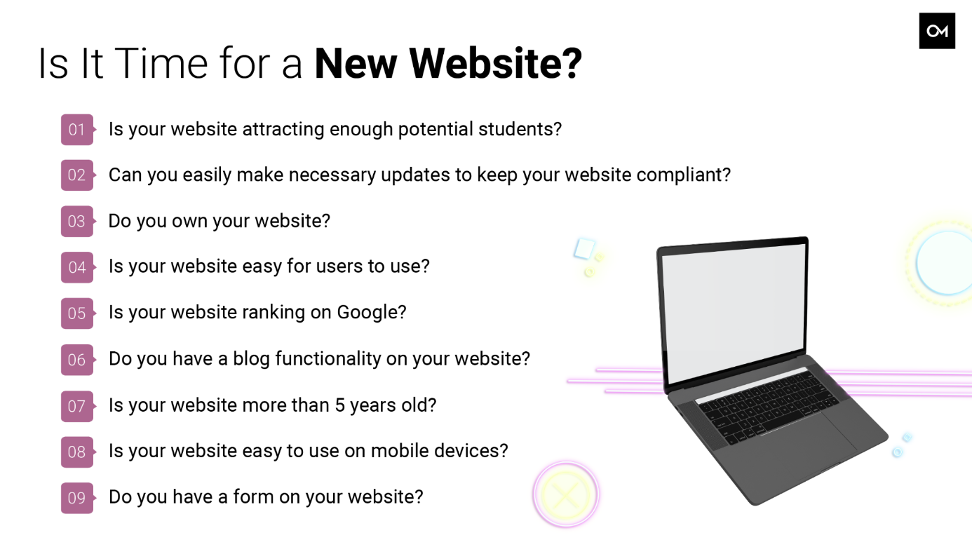
At Oozle, we always want our website content to be easy to edit, especially with beauty schools, because offerings change or course catalogs need to be updated, or there’s some mandate that you have to have certain disclosures on your site. Screenshot this slide, and answer these questions to see if an Oozle website can help you elevate your school. Especially if your website isn’t on optimized on mobile, you could be missing out on a ton of revenue or profit.
In Need of A New Website? Talk to Becky!
We know that every lead is a potential opportunity for more profit, and conversion rate optimization can help maximize that return on investment. We have years of experience in building and optimizing websites and we’d love to help you out, so thank you. If you have any questions or anything like that, let me know. I think I just hit time, so if there are questions, great. If not, feel free to email me. I’ll probably send you off to someone else, because introvert.
Chris Linford:
Becky, that was awesome, so much good info. If you were taking notes, I mean, just implementing a few of these things, like taking your form from the bottom and putting it up top, could make a huge difference. I think a lot of really good information, super informative. Everybody in the chat, continue to show Becky some love. She’s an introvert, and she just killed it in this presentation and did an awesome job, so go, Becky. Good job.