LET’S TALK TYPE: A Guide to Typography
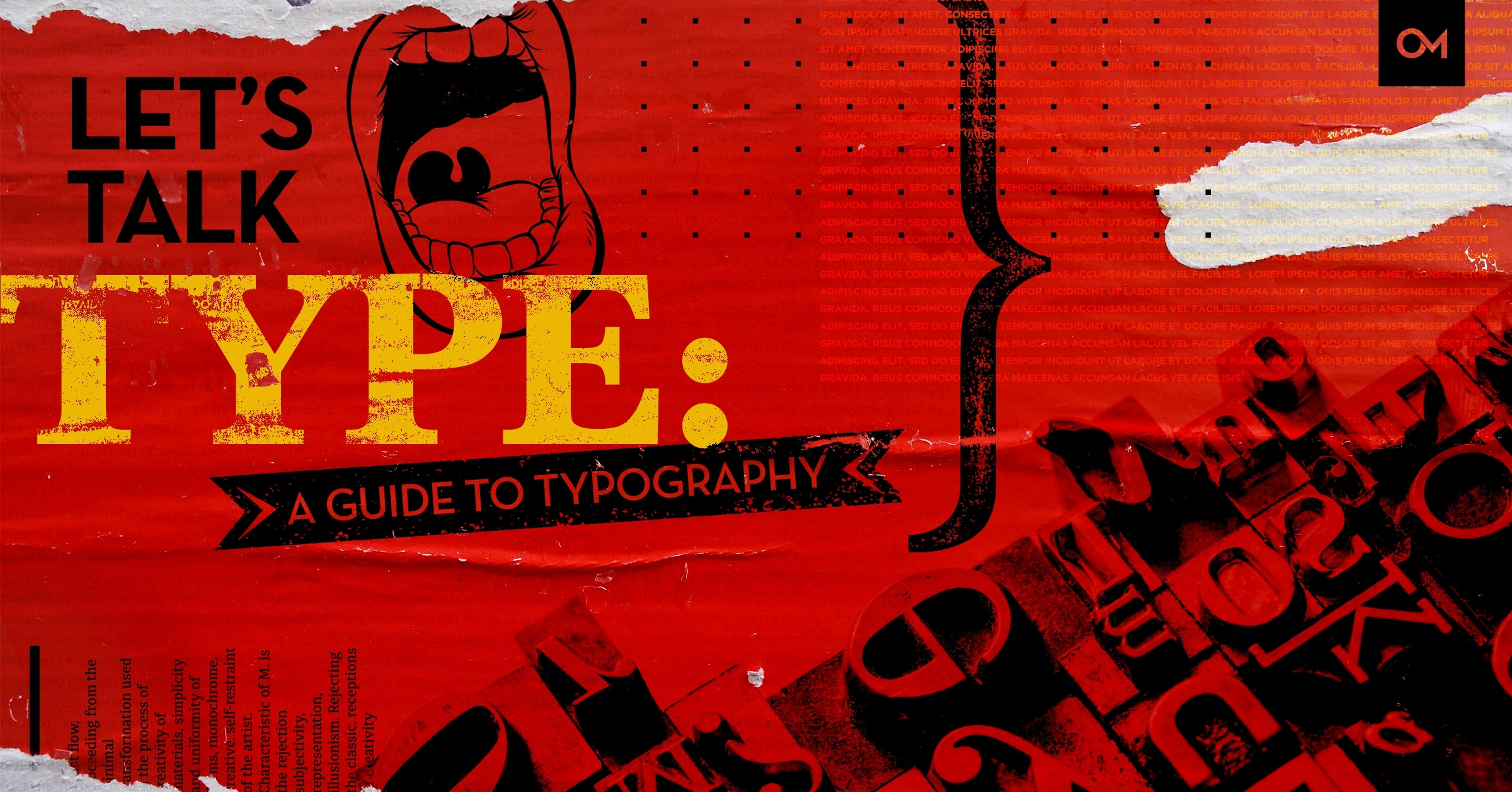
Headings, body text, line spacing, kerning, font choice, and font pairings — the world of typography is vast and understanding it is essential to good design.
Choosing the right font is often one of the most important parts of the design process. A thoughtfully chosen typeface can be the foundational stone that makes a design come together, and give it that polished, professional look and feel, while still maintaining clarity and readability.
To meet the demands of a visual world filled with businesses trying to find their place in the market, designers must create opportunities for people to engage with a brands products and services. The visual design of any marketing asset must be on point and at its center is the message and how that information is displayed.
WHAT IS TYPOGRAPHY?
To understand how typography affects your overall brand and messaging we must first define what it is. Google defines typography as, “the style and appearance of printed matter. The art or procedure of arranging type or processing data and printing from it.”
Typography is the visual component of written words.
Text is a sequence of words. Written text stays the same no matter how it’s displayed. Consider the sentence, “I love typography!” When this sentence is viewed in a visual way, whether its printed or uploaded onto Facebook digitally, typography gets involved. All visually displayed text involves typography—whether it’s on paper, a computer screen, or a billboard.
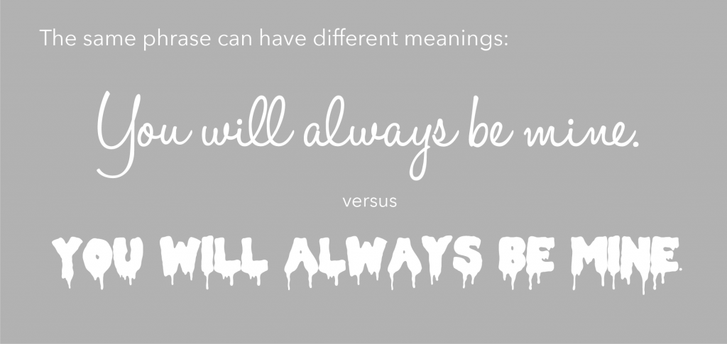
For example, what’s the difference between these two ads, the text or the typography?
Note: Don’t infer from the above examples that typography is another word for font. Fonts are part of typography, but typography goes beyond fonts. More on that later.
WHY IS GOOD TYPOGRAPHY SO IMPORTANT?
It may be something we often overlook, but typography plays an essential part in the design process. Each marketing campaign we see is specifically designed with a font to fit the brand. Typography can change the entire look and feel of a design, here are some reasons why typography is so important.
It attracts and holds the audience’s attention.
Used correctly, typography can convey a certain mood or feeling. Your audience needs to understand what the message you’re trying to send is and be interested in it. Having the appropriate font sets the tone for your design before you even begin.
It is readable.
Using fonts that are clean and easy to read are key to any design. When you’re delivering your message, if the fonts are too small or cramped together, your ad campaign will immediately be ignored. It’s fun to have a cool and complex project, but the audience should be able to easily comprehend what your message is.
It establishes information and visual hierarchy.
By using different font sizes, font weights, types of fonts, and colors the audience can determine the most important points of your ads just by looking at them. By creating an engaging story, this makes it easier for your audience to follow along and pay more attention to your message.
It creates consistency.
The key to any good marketing campaign is consistency in design and composition. Establishing branded fonts for titles and body copy creates cohesiveness. Staying consistent with the fonts that you use and the way they are laid out will allow customers to identify your message and key components of your marketing assets with your brand identity.
DESIGNING WITH GOOD TYPOGRAPHY
As we defined before, typography is, at its core, the art and technique of arranging type. It is an important skill that all professional designers need and is about much more than making the words legible. Your choice of font and how it works within your layout, grid, color scheme, and so on will make the difference between a good, bad and great design.
Before we continue I would quickly like to define what is the difference between font and typeface.
Fast Company In brief states: “A font is what you use, a typeface is what you see.”
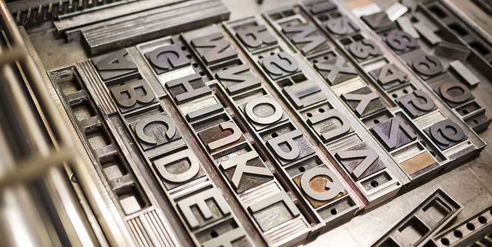
In the good old days of analog printing, every page was laboriously set out in frames with metal letters. The letters were rolled in ink, and then it was pressed down onto a clean piece of paper. That was a page layout. Printers needed thousands of physical metal blocks, each with the character it was meant to represent set out in relief (the type face). If you wanted to print Garamond, for example, you needed different blocks for every different size (10 point, 12 point, 14 point, and so on) and weight (bold, light, medium). This is where we get the terms typeface and font.
Think of the typeface as a music album and the fonts are all the songs inside the album.
Moving forward we are going to cover some of the basics when working with type.
Font Selection.
Your first concern is choosing a font that matches the message or purpose of your design. Before you ever start browsing through fonts that are available, it would be a good idea to brainstorm some of the qualities or characteristics that you want your design to communicate.
Font Types.
Here are the basic font types you will encounter as a designer.
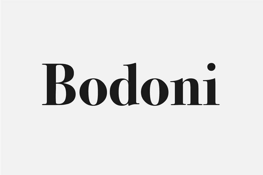
Serif – A classic typeface has serifs – those delicate little points that extend from the terminals of most of the strokes that make up the letters. The serifs form feet, grounding it and giving it a sense of structure along with a flourish.
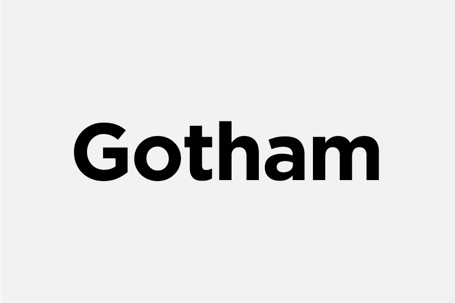
Sans-Serif – As the name suggests, sans-serif typefaces are without serifs. Originally designed for display purposes, sans-serif typefaces have been refined to work well as body copy and other layout elements such as captions and annotations. The absence of narrow and fiddly serifs mean they function better on screens, making them excellent for websites, apps and screen
based design.
They’re popular in a corporate context, often regarded as the typefaces of modern or tech business. Designers find them particularly useful for posters, signs and digital screens. One of the world’s most popular sans-serifs is Gotham.
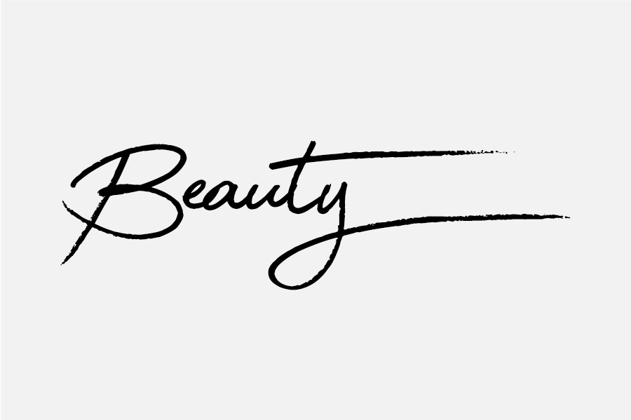
Script – Script fonts mimic the features you’d find in handwriting. As a result, there are many different styles. Some contemporary script fonts attempt to replicate the natural flow of writing in a very elegant way, with swooshes and end strokes that swing back underneath the letters for emphasis. They are very much display typefaces.
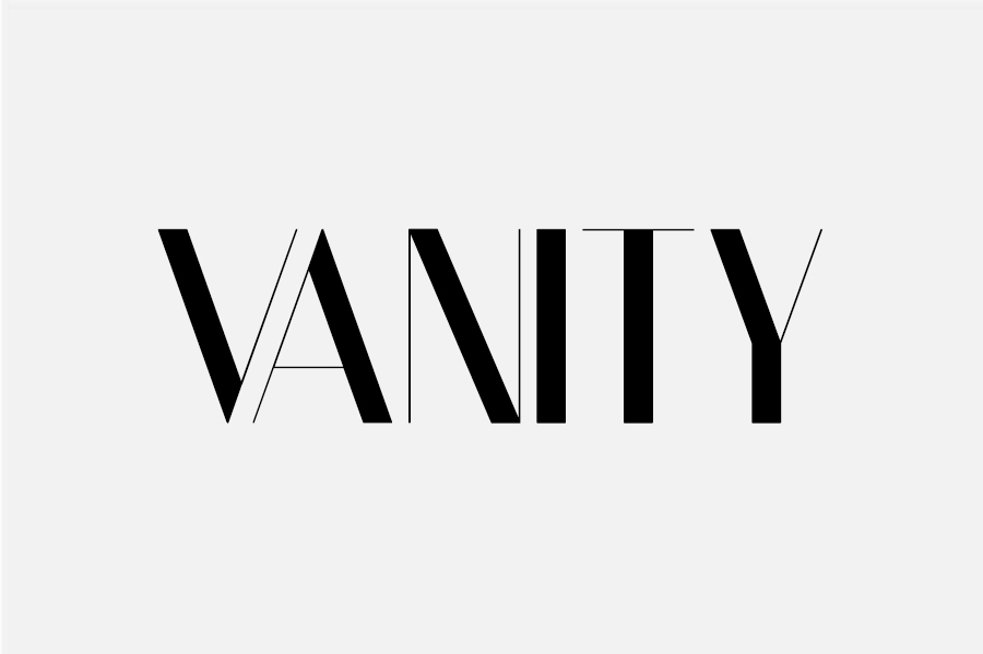
Display – A display typeface is one specifically designed for signs, advertising and headlines rather than body text. It can be serif, sans, script, or from one of the many specialist subcategories of type. Most display fonts are designed for maximum legibility at large sizes.
Size.
All typefaces are not created equal. Some are fat and wide; some are thin and narrow. So words set in different typefaces can take up a very different amount of space on the page.
The height of each character is known as its ‘x-height’ (quite simply because it’s based on the ‘x’ character). When pairing different typefaces, it’s generally wise to use those that share a similar x-height.
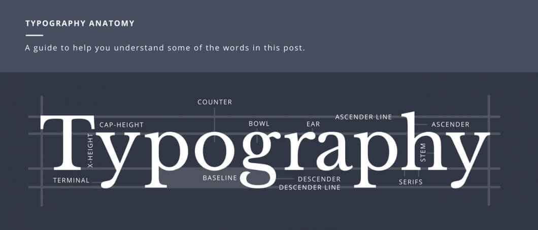
The Logo Company put together this stylish infographic that clearly explains the alphabet of typography terms.
The width of each character is known as the ‘set width’. This spans the body of the letter, plus the space that acts as a buffer between one letterform and the next.
The most common method used to measure type is the point system, which dates back to the 18th century. One point is 1/72 inch. 12 points make one pica, a unit used to measure column widths. Type sizes can also be measured in inches, millimetres, or pixels.
Leading.
Leading describes the vertical space between each line of type. It’s so named because, in the days of metal typesetting, strips of lead were used to separate lines of type. For legible body text that’s comfortable to read, a general rule is that your leading value should be anything between 1.25 and 1.5 times greater than the font size.
![]()
Kerning & Tracking
Kerning is the process of adjusting the space between characters to create a harmonious pairing. For example, where an uppercase ‘A’ meets an uppercase ‘V’, their diagonal strokes are usually kerned so that the top left of the ‘V’ sits above the bottom right of the ‘A’.
Kerning is similar to tracking, but they are not the same thing. Tracking is the process of adjusting the spacing of all characters in a word, and is applied evenly.
![]()
![]()
Art vs Function
The fact that this awareness of how words ‘look’ is now becoming mainstream should lead to professional designers of all kinds to take careful note of typefaces they chose and how they use them.
Since typeface designs have an inherent visual language or voice, brands need to be particularly sure the typeface speaks in the right tone, art style and is legible under the conditions it will
be used.
Combining Fonts
Choosing two or more fonts to use together can be tricky. You want the fonts to complement each other, but not be too similar — different, but not so wildly different that they clash. Avoiding these extremes of too little or too much contrast often ends up being a process of experimentation and trial-and-error.
Finding a font combination with a level of contrast isn’t a step-by-step process, but is usually the result of a mash-up of personal taste, practice, instinct, and observation. But this process doesn’t have to be completely mysterious. While you’re developing an eye for pairing fonts, you can take a few shortcuts to get started:
- Find a shared quality: Fonts that look significantly different but share something in common are more likely to work well together. That quality might be general proportions like letter height or width, or two fonts might share an underlying structure or skeleton. Even if the similarity is subtle, it will help give your font combination a basic cohesiveness.
- Give each font a job: Your chosen fonts will need to be different enough that they create a clear visual hierarchy — showing viewers where to look and what’s important. One sans-serif and one serif font are often enough to do this effectively.
- It is extremely important to note the number of different fonts you are using in a design. At most you will want to use three different fonts but more often than not, two is the sweet spot. This will keep your design clean and professional looking.
Font Weights
You will also want to consider using different font weights together. For example, you can use the same font but the top sentence is light and the bottom sentence is bold or together in the same sentence.
A great visual, creative marketing campaign starts with design. All design elements, images and messaging must come together to create the polished layout. Your message and how it is displayed to your audience is at the center of good typography.
Remember, creating good brand identity builds trust. If you audience trusts who you are visually, they are more likely to do business with you.
When you hire Oozle Media to fill your digital marketing needs, you gain access to our graphic designers who can create custom artwork that keeps your brand current and competitive in your marketplace. You can contact us anytime online, or call us at 877-986-6529.
Great work and information! Thanks!