15 Graphic Design Trends For 2018
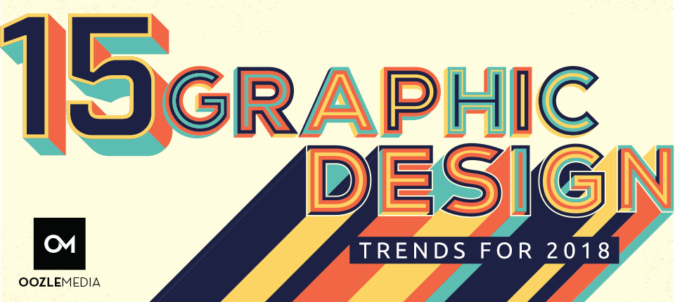
Design trends are constantly changing. Being able to keep up with and implement them is an important talent for designers to have. Great designers don’t ignore trends; they study and understand them in order to better their work. As Graphic Designers at Oozle Media, our clients rely on our expertise to create eye-catching, elegant designs that accurately represent their brand, voice, products and services. By connecting with the latest trends in design we can design smarter and make more informed decisions and artistic choices.
Philip Van Dusen published a video on YouTube where he outlines his 15 trends in Graphic Design for 2018. Philip VanDusen is the founder of Verhaal Brand Design, a strategic design and branding consultancy in the New York City metro area.
From his list the graphic design team at Oozle Media has showcased actual artwork created to stay on top of these trends and give our clients work that is contemporary and relevant to today’s digital marketing and advertising.
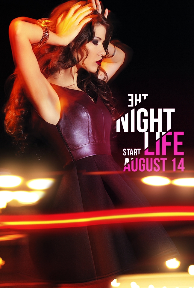
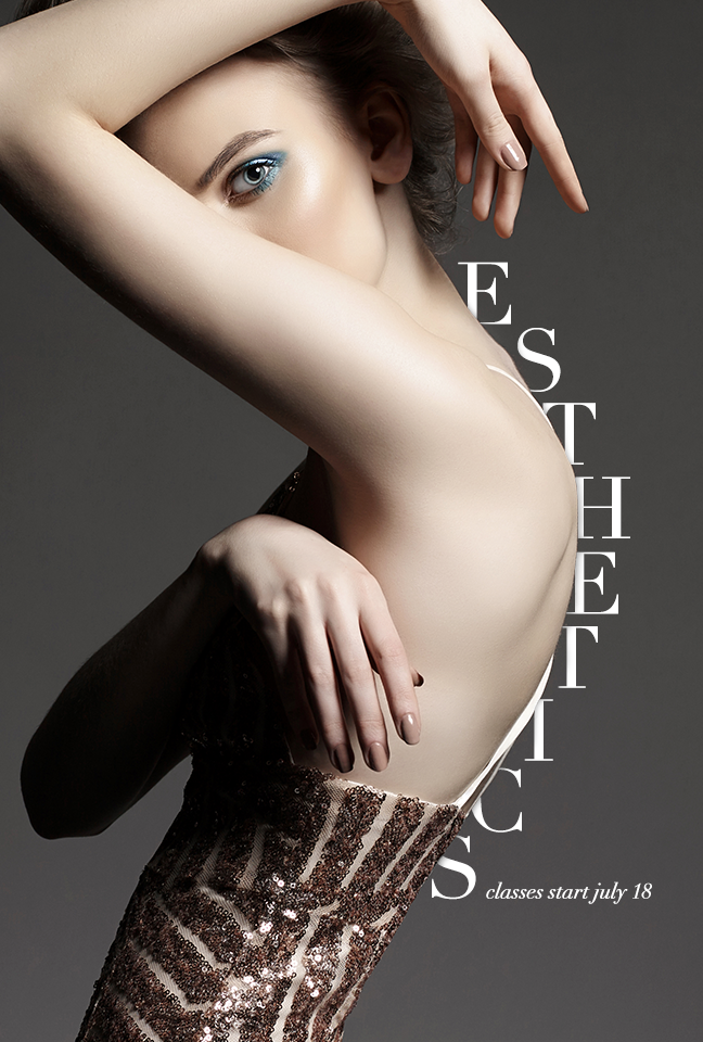
TREND 1: DISJOINTED TEXT
Disjointed text is an interesting visual take on typography. The designer is creating a kind of abstract take on the letter forms by creating separation between each letter in the word or phrase. The idea is to bring the message and content into the design but still keep the design more visual rather than something that you read.
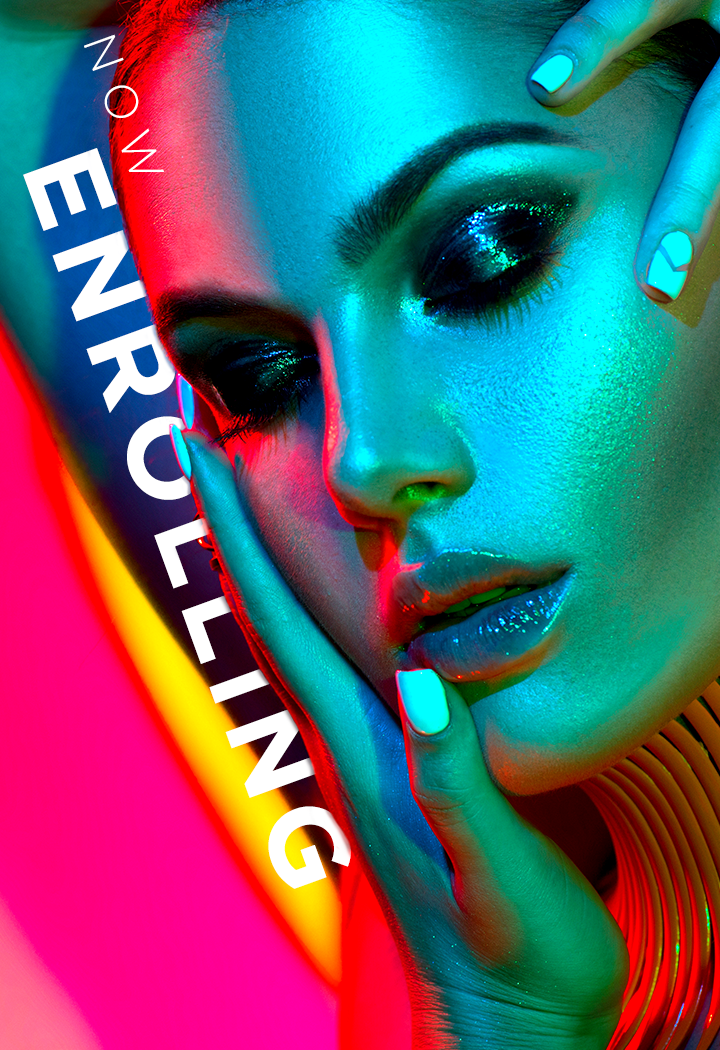
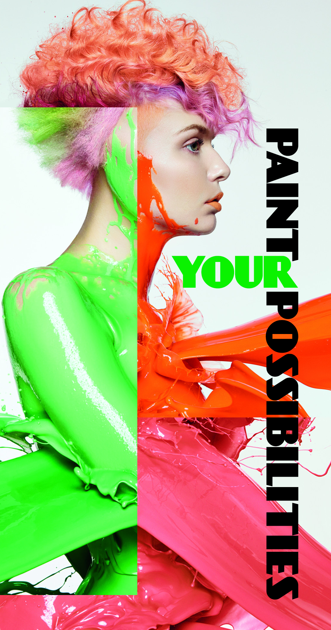
TREND 2: BRIGHTNESS
Brightness is using a lot of really loud colors. Very bright and very neon colors are juxtaposed with opposing colors or colors that are opposite each other on the color wheel such as purple and yellow.
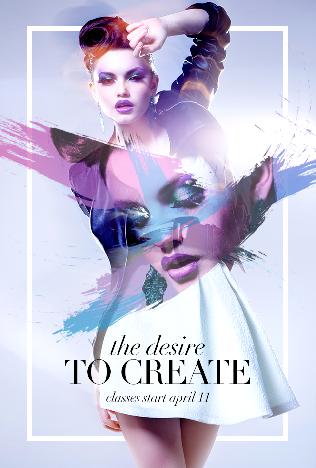
TREND 3: GLITCH
This trend is showing up a lot these days. Glitch is imagery that looks like it’s being transformed or broken up by some sort of digital interference. This design trend can elicit a fascination with distress, deconstruction and the eerie beauty of imperfection.
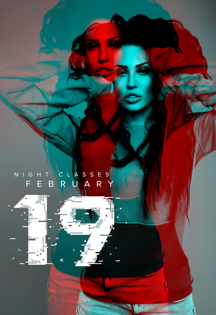
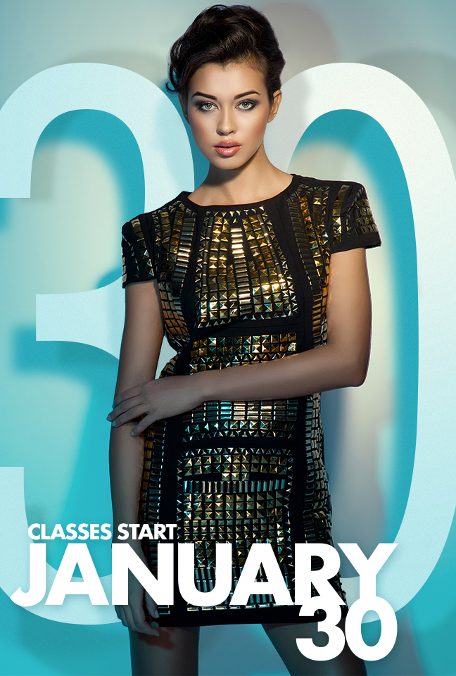
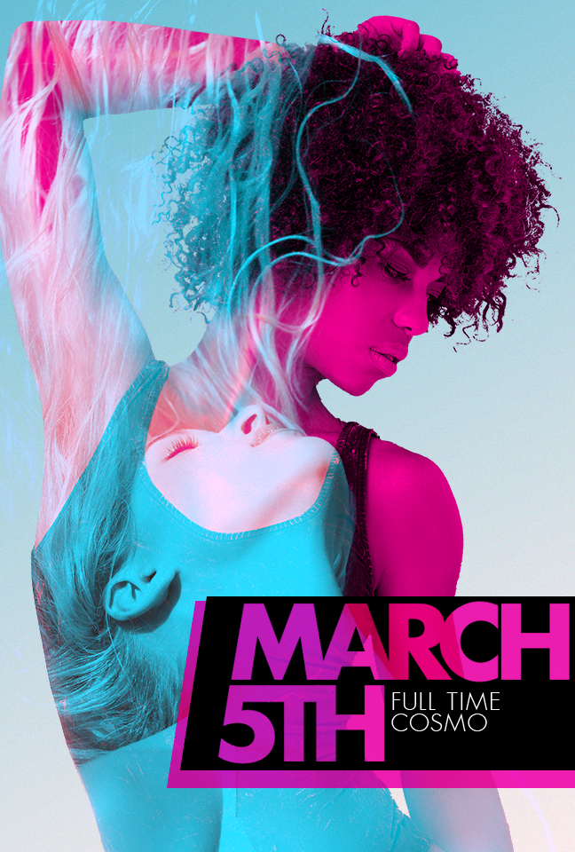
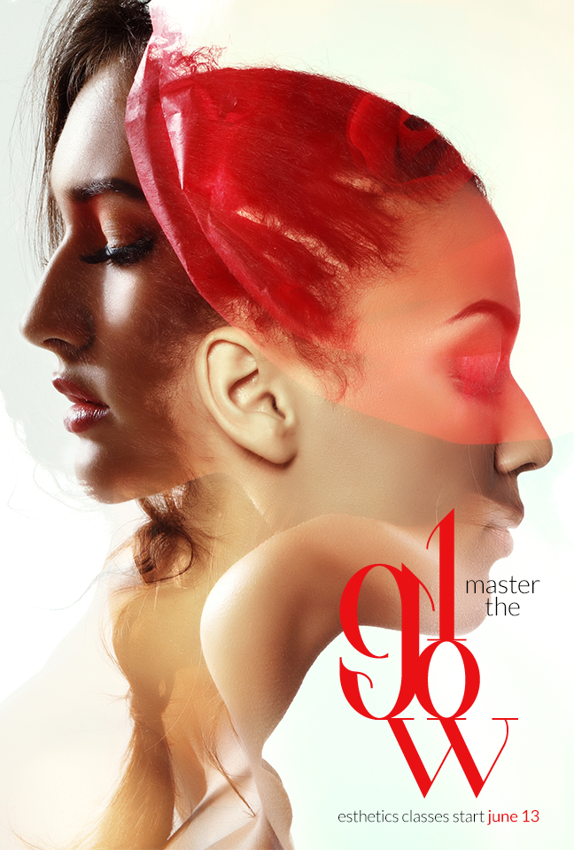
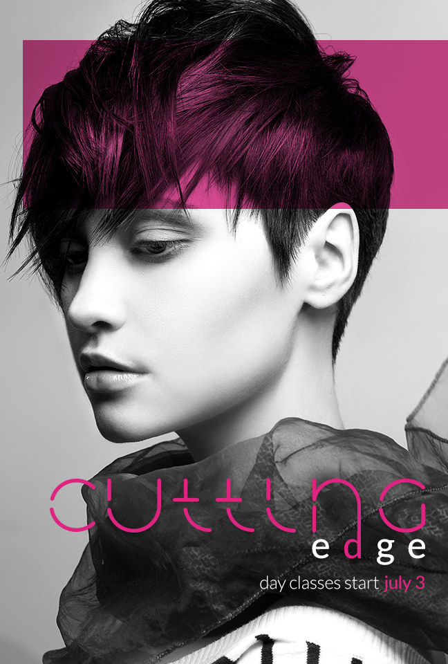
TREND 4: COLOR CHANNEL
Color channel is if you took some imagery and you broke out all of the CMYK or RGB colors and overlaid them with various levels of transparency. It is trending in both text and imagery.
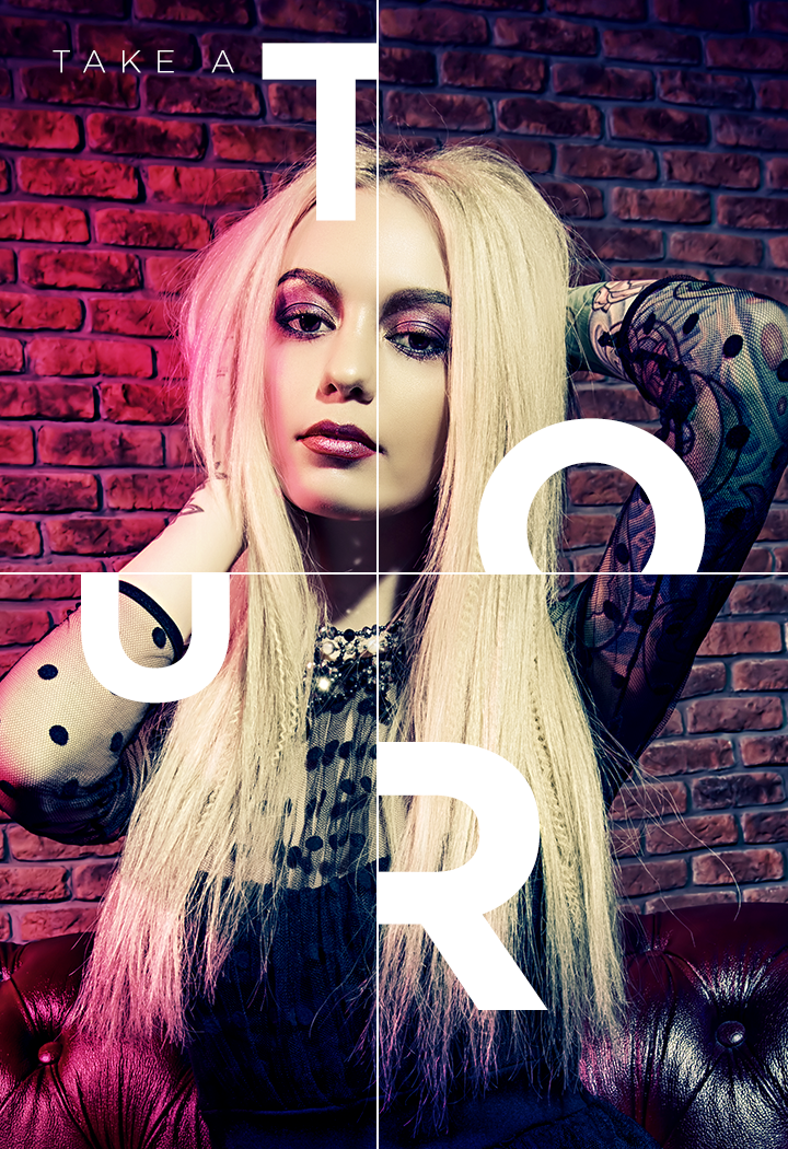
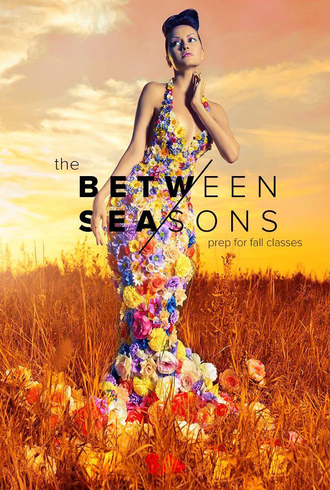
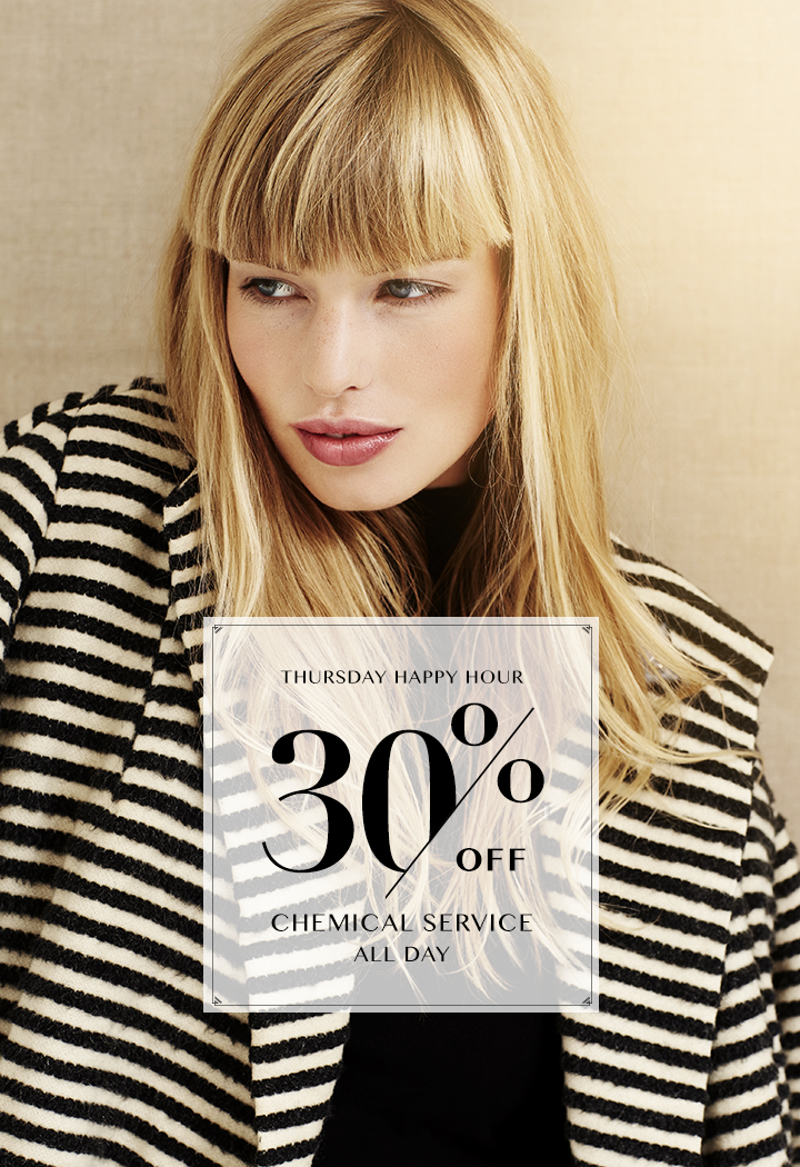
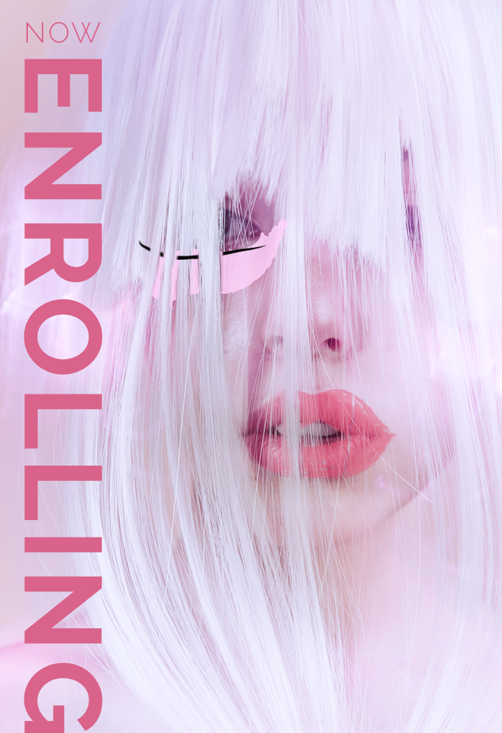
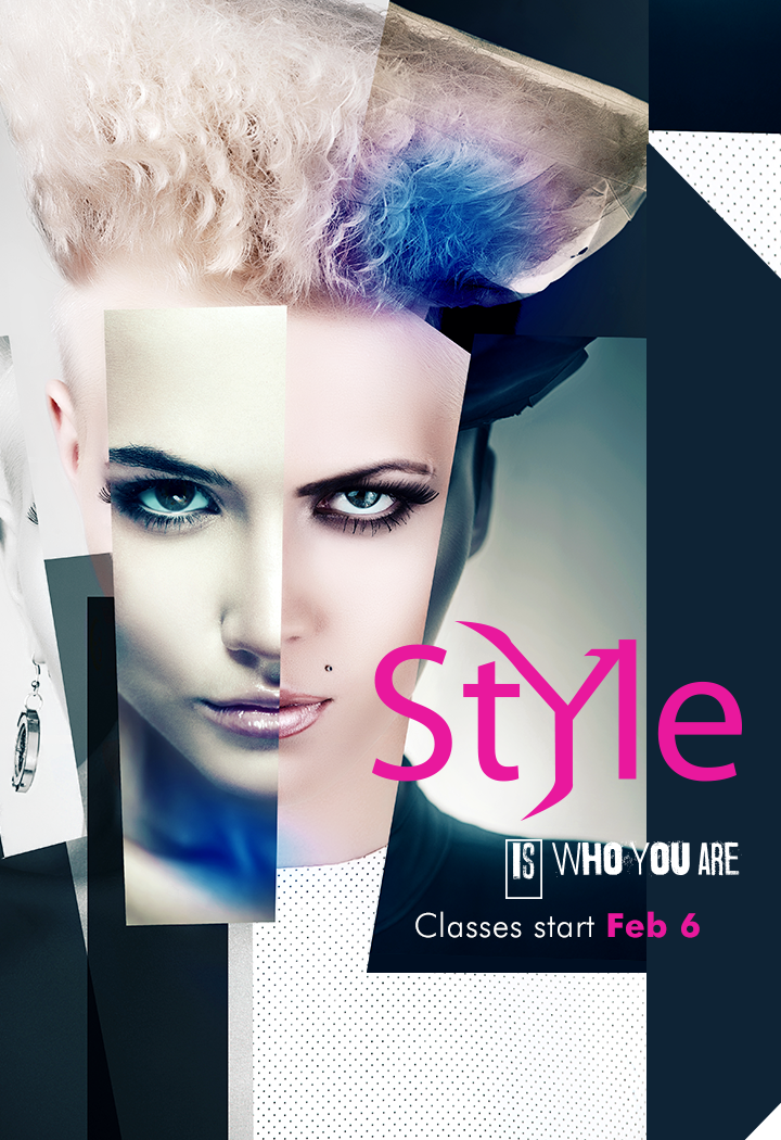
TREND 5: SLICED TEXT
Sliced text is a little like disjointed text but it’s more like whole words are being sliced with an exacto knife, for example. It creates a collage type feel and can give your typography a visual interest.

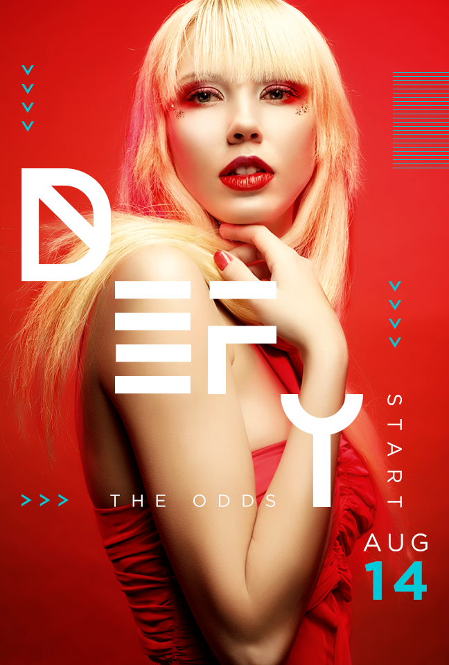
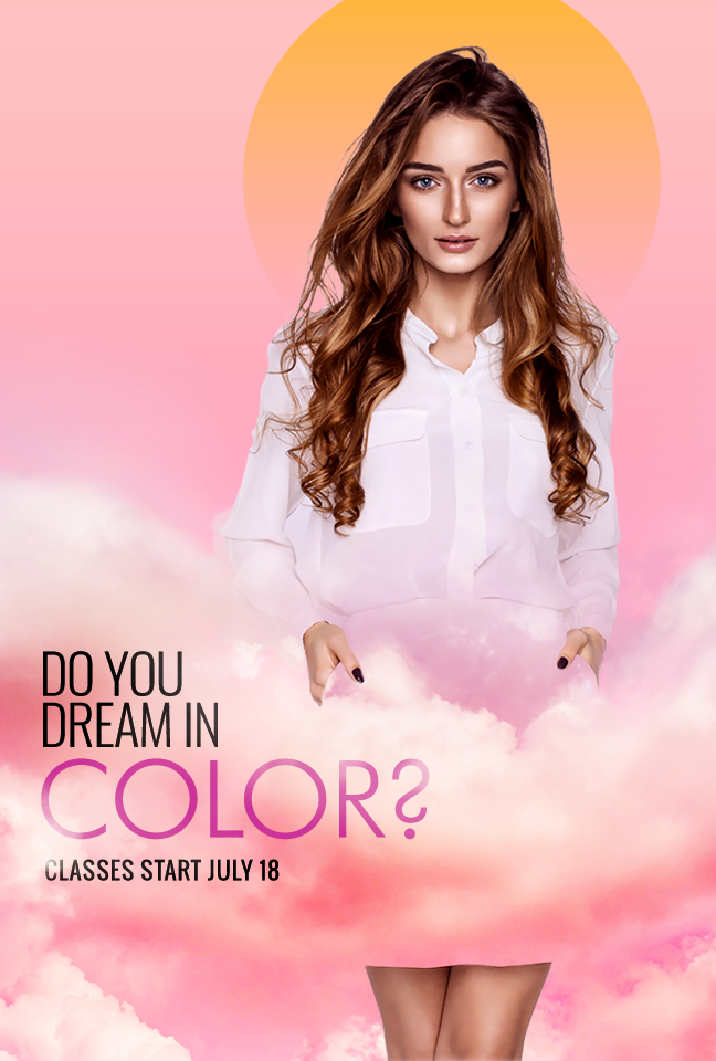
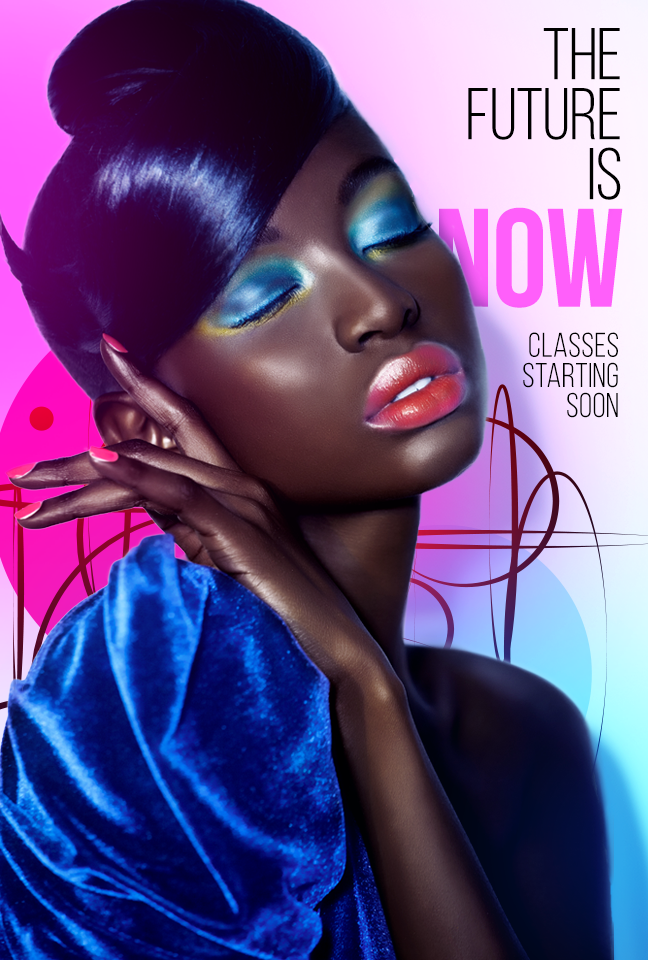
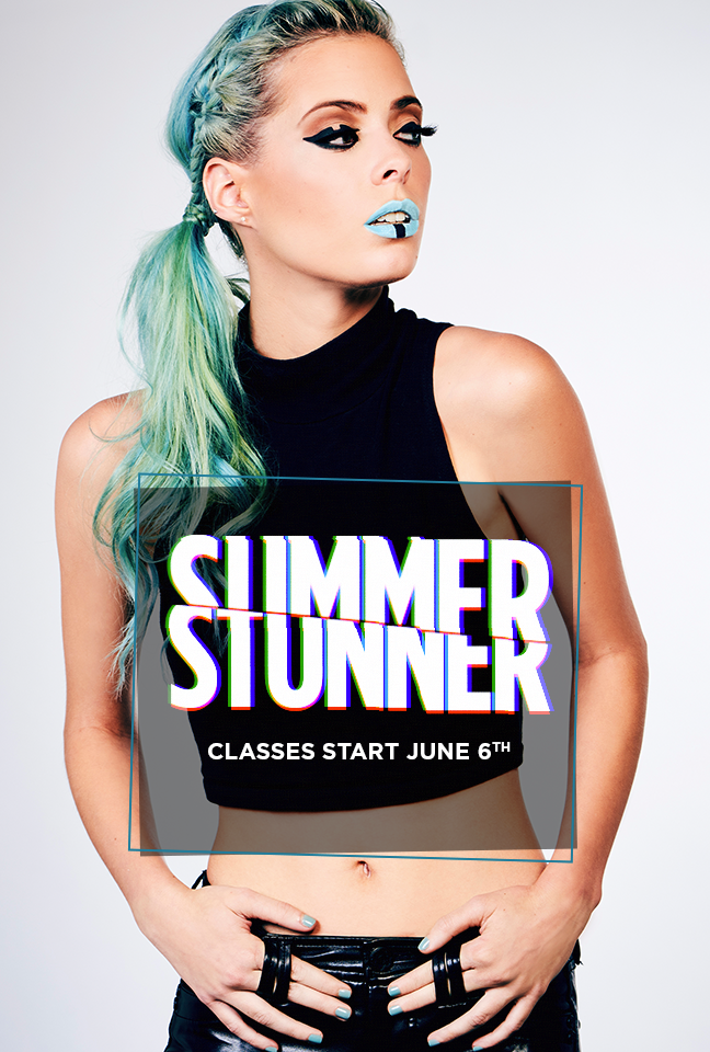
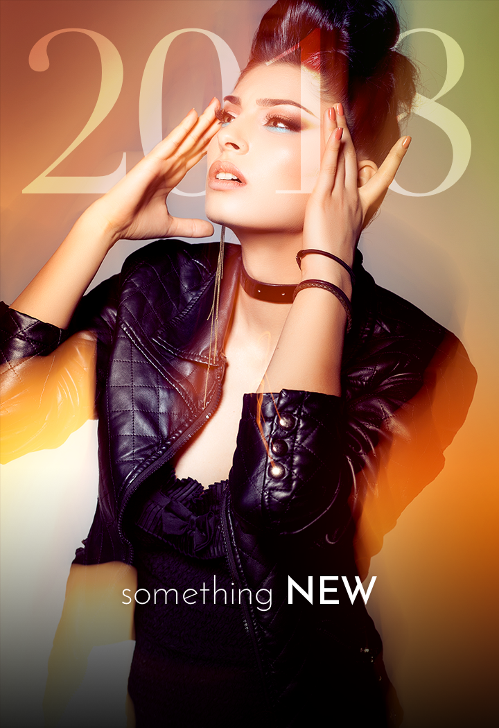
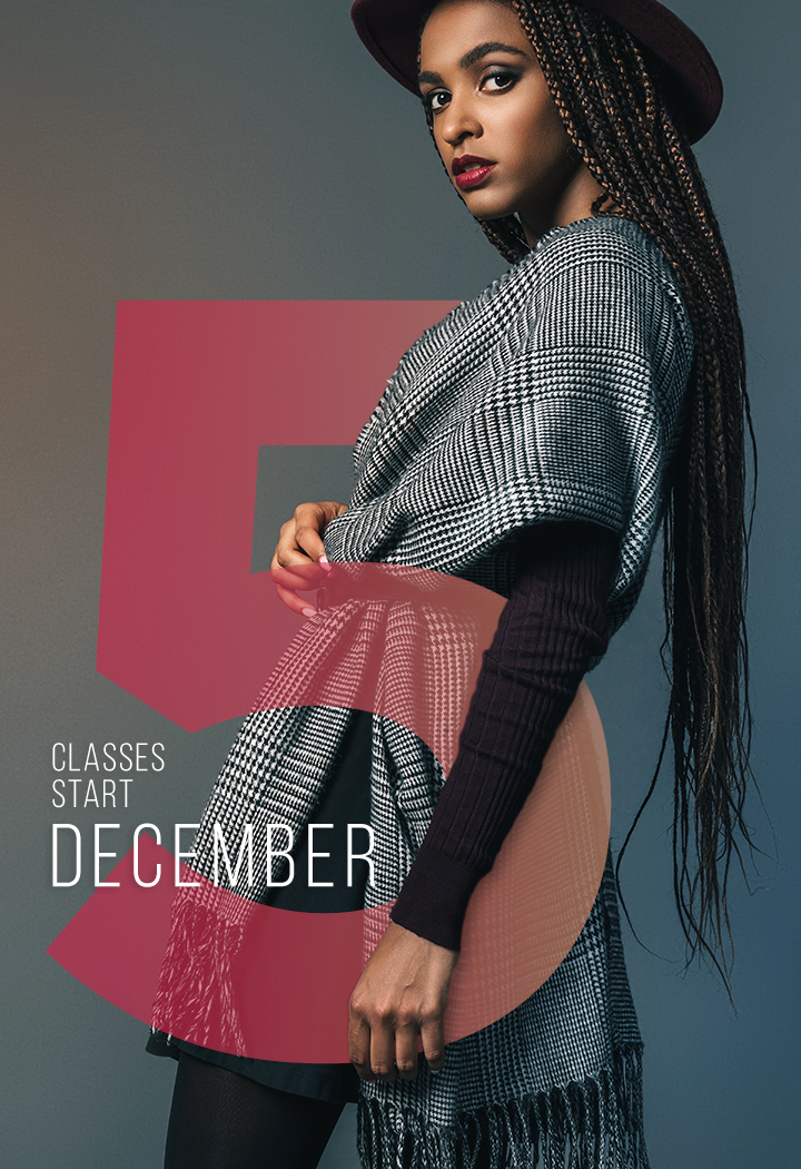
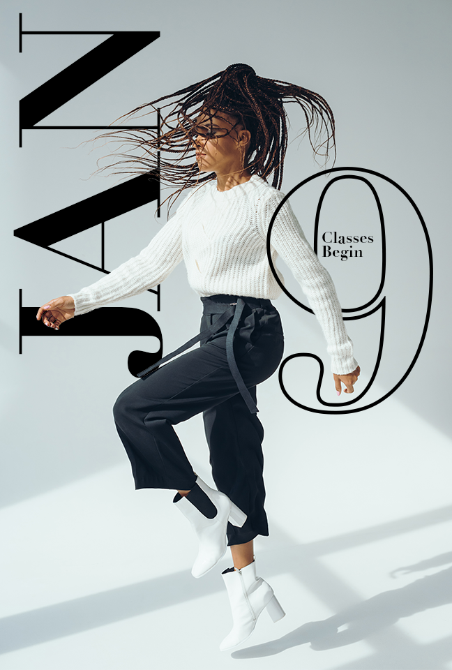
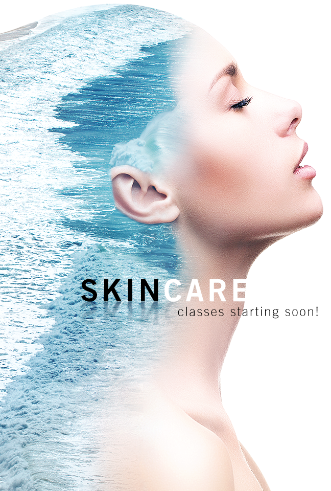
TREND 6: INTEGRATION
Integration is where you take fonts or letter forms or numbers and you integrate it very closely with photography. Think of it like the text and the photograph are living in the same physical space. There is always a visually interesting way they are interwoven with each other. This is a very popular trend and can be used in vastly different visual and creative ways.
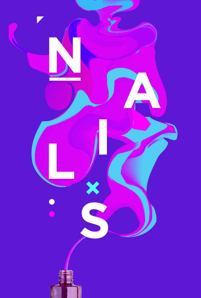
TREND 7: LIQUID
Liquid is an interesting take on typography and it makes use of visual highlights when you see liquid pooling. It can be used in a 3D or 2D way combining font pairings with liquid traits from ink to paint. There are a number of ways you can address the liquid trend in your designs.
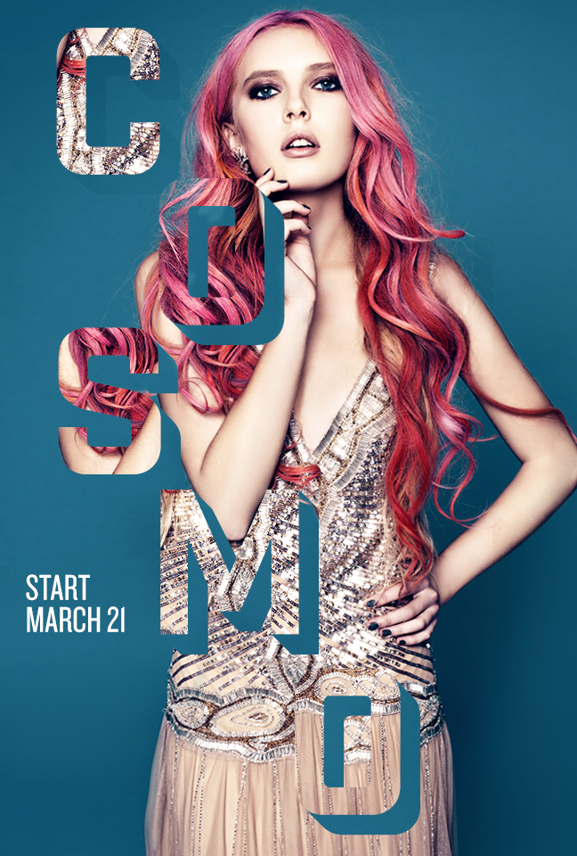
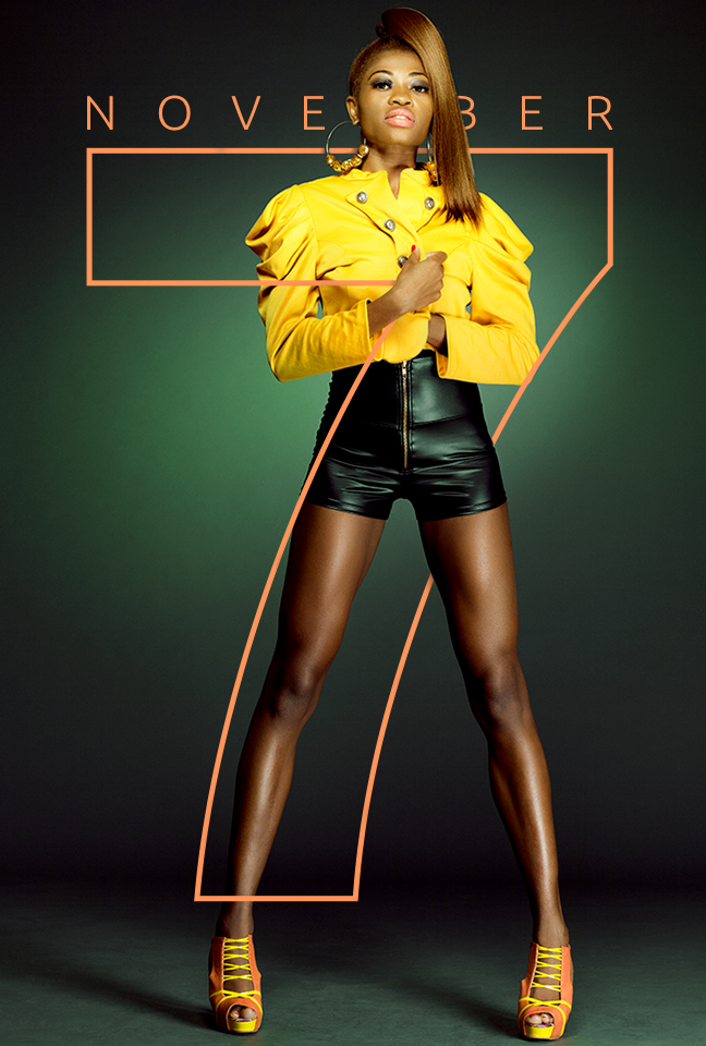
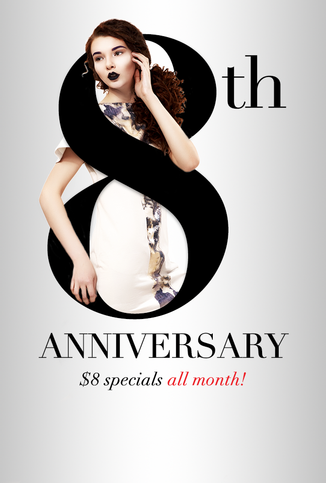
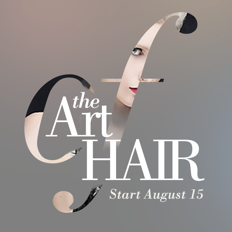
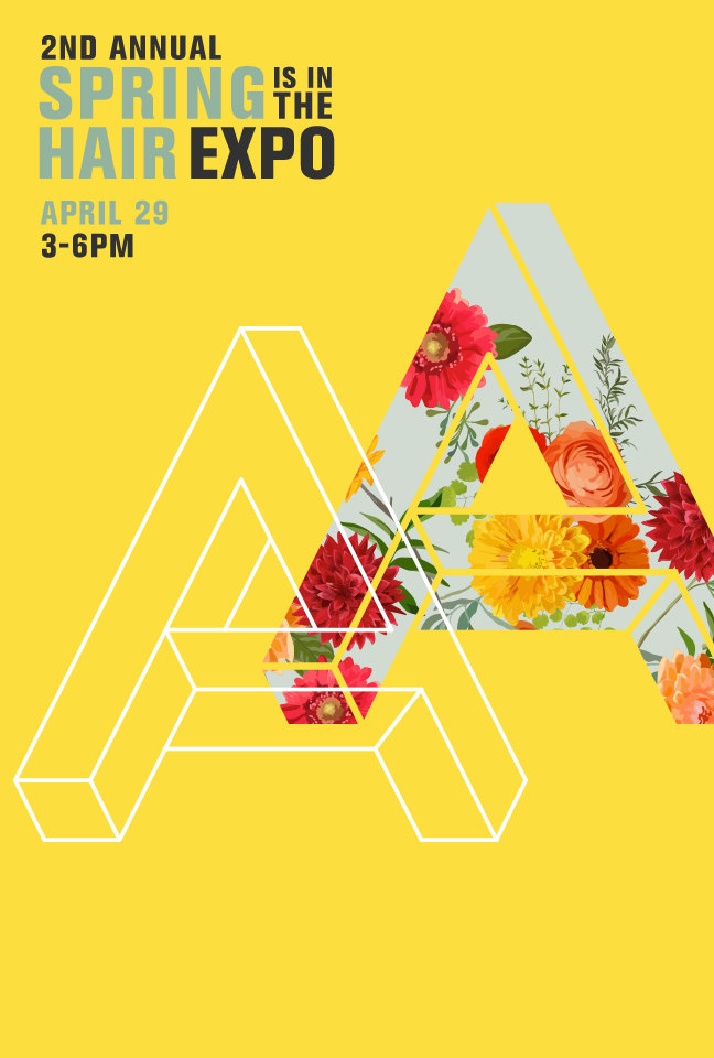
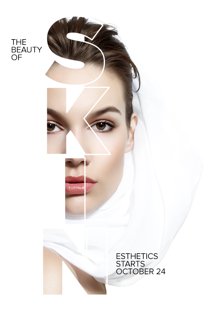
TREND 8: FONT AS ILLUSTRATION
Using a font or a letter form or a number form as an illustration element in and of itself. This can be used in conjunction with photography and masking elements of the photo into the letter or number form. The letter or number form can also be used to create the subject of your composition.
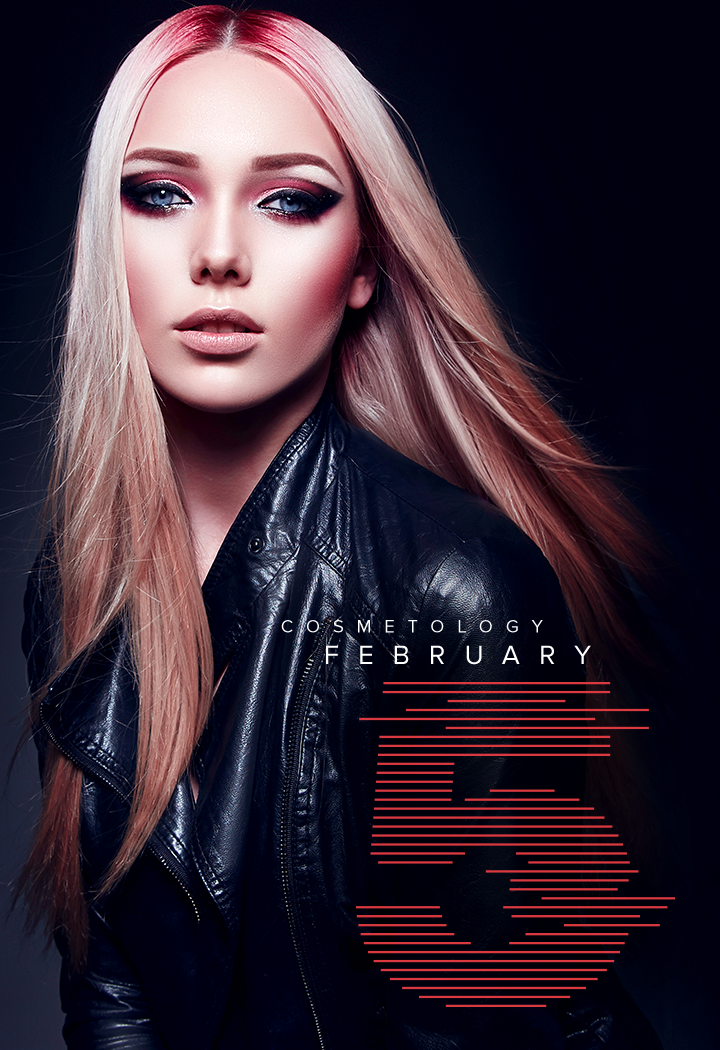
TREND 9: ICONIFICATION
Iconification is taking photography, illustration or imagery and bringing it down to its most simple linear form and creating to a certain extent an icon out of it. These can be created using depth, gradients and hand drawn elements.

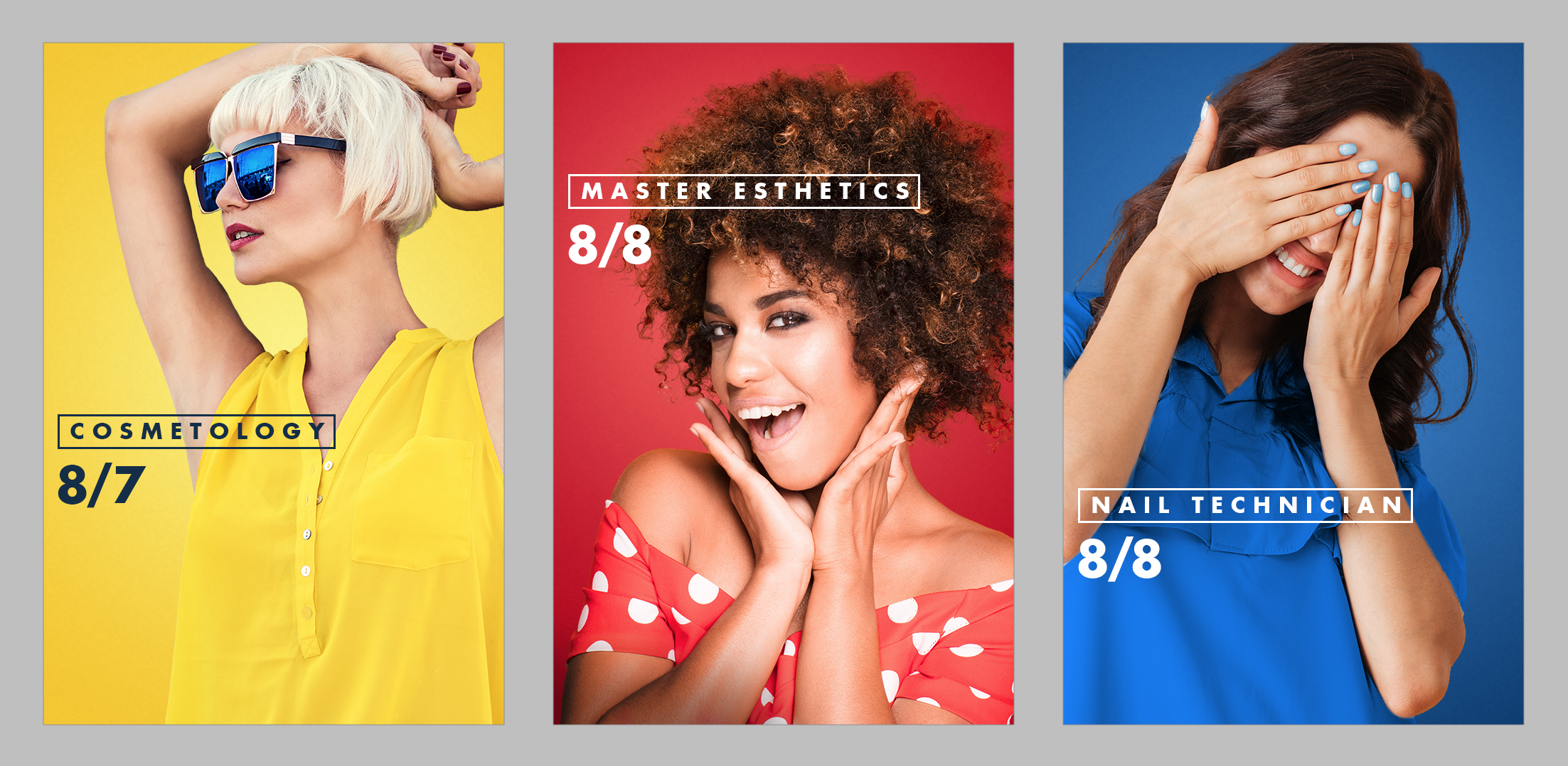
TREND 10: PLAYBILL
Playbill references old fight posters or musical posters of the 20’s and 30’s or even in the 70’s and 80’s but it’s layering texts in different shapes and different orientations. It’s fascinating trend in methodology that you can use in a number of different ways.
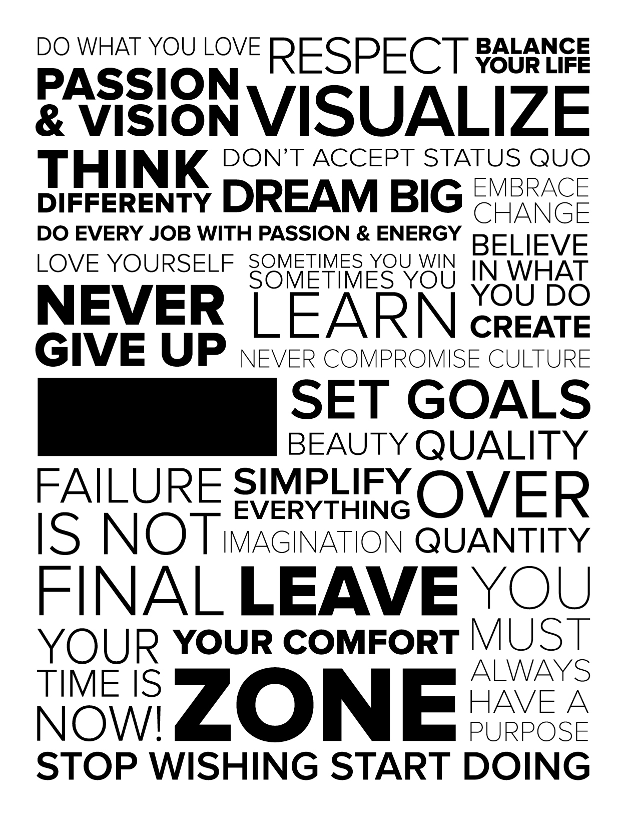
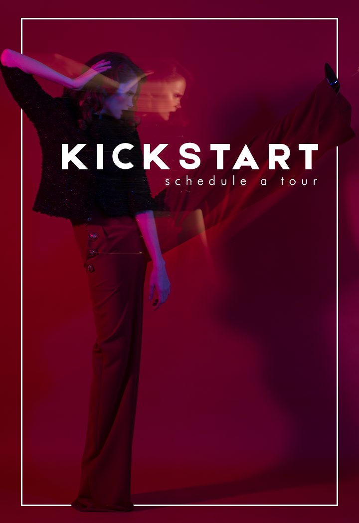
TREND 11: TEXT AS DESIGN
This is kind of like text as illustration but it’s different in the fact that it’s using fonts and using text forms as the illustration or design as is. It’s not using any kind of photography or illustration other than the letter form. It might use different font combinations or various scaling and overlaying or cropping to give the design visual interest.
TREND 12: SYSTEMATIC COLOR
When you do a logo and a brand identity system you generally design it in its higher palette so it looks like an entire system. This can be used in many ways but overall there’s a very tight color palette being used.
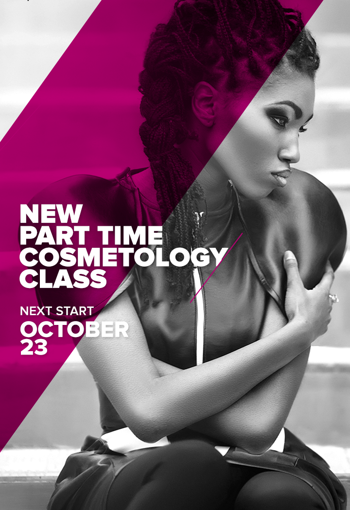
TREND 13: DECONSTRUCTIVISM
Deconstructivism harkens back to russian deconstructivism and the art and design movement in the previous century. It also harkens back a little bit to how fine artists are showing work in the data movement. This is using stark monochromatic type designs interspersing black-and-white photography and bright colors, broken letter forms, chopped design elements, chopped spatial elements in a very collage sort of way. It is characterized by an absence of harmony, continuity, or symmetry. The finished visual appearance is characterized by unpredictability and controlled chaos.
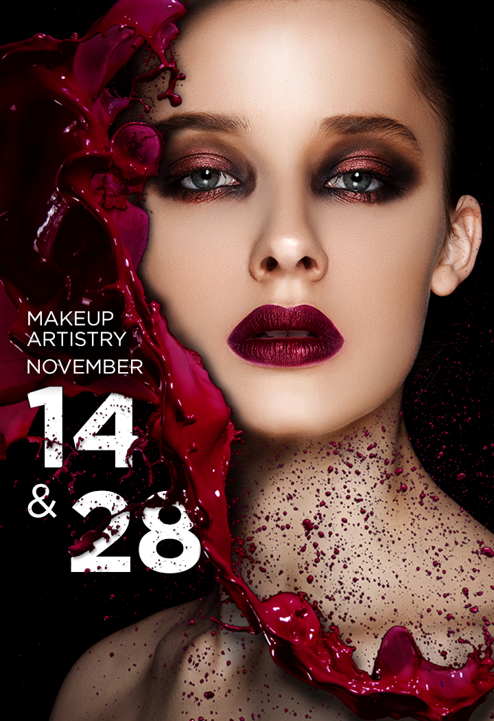
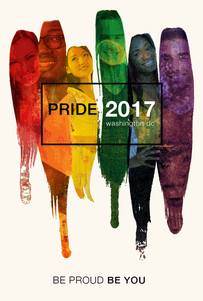
TREND 14: PHOTO MASKING
Photo masking is similar to the previous trend, Integration but it’s different in that you are using text elements, bars of color shapes to mask photography. You can also use shapes to mask a photograph within a photograph (have you gone cross eyed yet?)
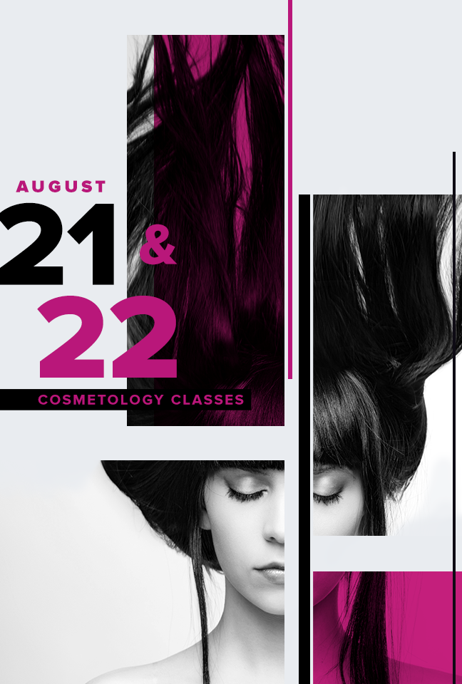
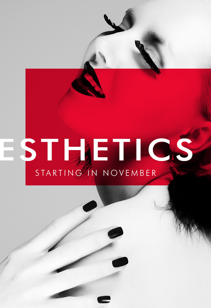
TREND 15: TRANSPARENCY
Transparency is a little like Color Channel in the fact that you use transparent color as a design element. The transparency trend in this case is a little more specific in that the colors cut into geometric shapes are generally overlaid over black and white photographs to create a stark contrast between color and photography. These elements can also highlight certain areas of the composition and create visual hierarchy.
![]()
Those are the trends for 2018!
When you hire Oozle Media to fill your digital marketing needs, you gain access to our graphic designers who can create custom artwork that keeps your brand current and competitive in your marketplace. You can contact us anytime online, or call us at 877-986-6529.
Very useful and nice
thank you very much
It should be the Dada movement, not data (#13).